Create a logo generated from your initials, structured / modulated as per a criteria set by yourself.
From Wikipedia - a logotype is a graphic mark, emblem, or symbol used to aid and promote public identification and recognition. It may be of an abstract of figurative design or include the text of the name it represents as in a wordmark. || a wordmark is distinct text-only typographic treatment of the name of a company, institution, or product name for the purposes of identification and branding.
Criteria
Open to change
Open to change
Architecture student (learn, act, review)
Refers to Chinese and Canadian origins
Modern, progressive, open-thinking, experimental
To create a strong foundation, stability
Refers to Chinese and Canadian origins
Modern, progressive, open-thinking, experimental
To create a strong foundation, stability
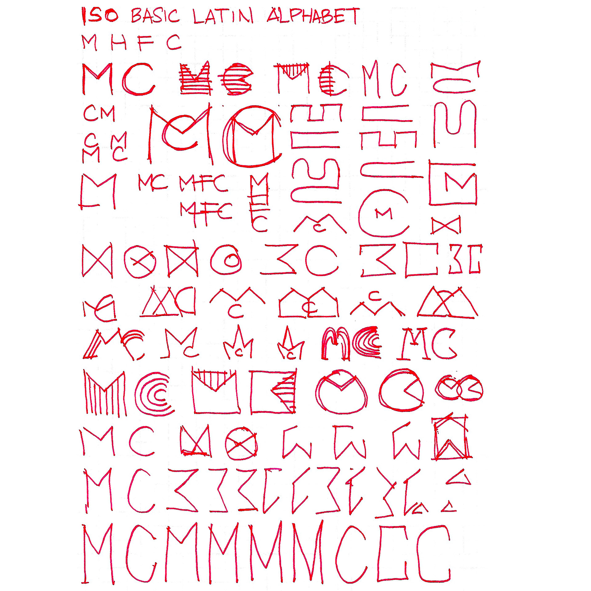
ISO Basic Latin Alphabet
Wikipedia
Wikipedia
Marco Hou-Fai Cheung
MC || CM || CHF
MHFC || CHFM
MHFC || CHFM
M
derived from the Phoenician Mem, via the Greek Mu (Μ, μ), derived from the Semitic Mem,
derived from a "Proto-Sinaitic" adoption of the "water" ideogram in Egyptian writing.
derived from the Phoenician Mem, via the Greek Mu (Μ, μ), derived from the Semitic Mem,
derived from a "Proto-Sinaitic" adoption of the "water" ideogram in Egyptian writing.
F. Simons, "Proto-Sinaitic — Progenitor of the Alphabet." Rosetta 9. (2011)
C
derived from the letter of G (Semite named as 'gimel' for 'camel'),
derived from the adoption of a "staff sling" ideogram in Egyptian writing.
derived from the letter of G (Semite named as 'gimel' for 'camel'),
derived from the adoption of a "staff sling" ideogram in Egyptian writing.
Writing: Theory and History of the Technology of Civilization." Wiley Blackwell. (2009)
H
derived from the Phoenician Heth, via the Greek Heta, derived from the Semitic ħ,
derived from a "Proto-Sinaitic" adoption of a "fence" ideogram in Egyptian writing.
derived from the Phoenician Heth, via the Greek Heta, derived from the Semitic ħ,
derived from a "Proto-Sinaitic" adoption of a "fence" ideogram in Egyptian writing.
F
derived from the Phoenician Waw, via the Greek Digamma,
derived from a "Proto-Sinaitic" adoption of a "hook / club" ideogram in Egyptian writing.
derived from a "Proto-Sinaitic" adoption of a "hook / club" ideogram in Egyptian writing.
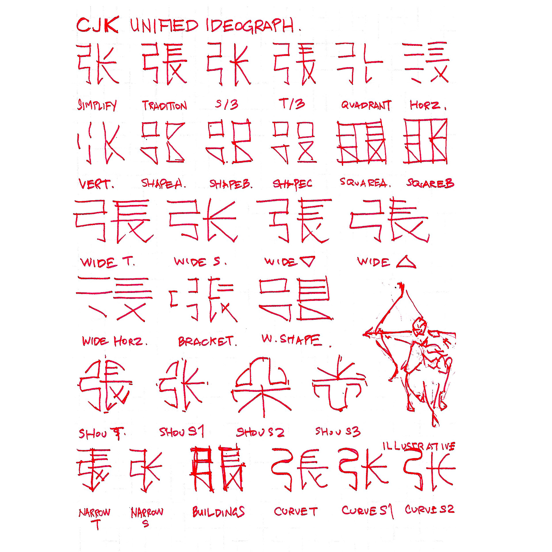
CJK (Chinese, Japanese, Korean) Unified Ideograph
Wiktionary
Wiktionary
张 || 張
(cheung, zhang)
to stretch; to open up; to spread
to expand; to spread
nervous; tense
Classifier for things with a flat surface: sheet
(cheung, zhang)
to stretch; to open up; to spread
to expand; to spread
nervous; tense
Classifier for things with a flat surface: sheet
弓
(gung, gong)
bow (weapon)
curved; arched
to arch; to bend
(gung, gong)
bow (weapon)
curved; arched
to arch; to bend
長
(cang, chang)
long (of distance)
length
long (in space); far; distant
long (of time); lasting
everlasting; permanent
constantly; frequently
straight; perfectly straight
upright; right; good; fine
strength; advantage; merit
skill; specialism
to excel in
(cang, chang)
long (of distance)
length
long (in space); far; distant
long (of time); lasting
everlasting; permanent
constantly; frequently
straight; perfectly straight
upright; right; good; fine
strength; advantage; merit
skill; specialism
to excel in
Precedent: Helvetica
Wikipedia
Wikipedia
Helvetica or Neue Haas Grotesk is a widely used sans-serif typeface developed in 1957 by Swiss typeface designer Max Miedinger with input from Eduard Hoffmann. Miedinger and Hoffmann set out to create a neutral typeface that had great clarity, no intrinsic meaning in its form, and could be used on a wide variety of signage.
Tall x-height. (readable at a distance)
Tight spacing between letters.
An oblique rather than italic style.
Wide / square capitals of uniform width. (E, F, S)
Bracketed, rounded, concave angles. (1, R, 7)
Two-storied 'a' (with curves of bowl and stem), and single-storey 'g'
Tight spacing between letters.
An oblique rather than italic style.
Wide / square capitals of uniform width. (E, F, S)
Bracketed, rounded, concave angles. (1, R, 7)
Two-storied 'a' (with curves of bowl and stem), and single-storey 'g'
Precedent: Vexillology
Legible within 2"x2" at 15" from eye
Simple
Meaningful symbolism
Use 2/3 basic colours
No lettering or seals
Distinctive
Simple
Meaningful symbolism
Use 2/3 basic colours
No lettering or seals
Distinctive
Precedent: Abstract - Paula Scheer, Jonathan Hoefler (Netflix)
Overshoot, Top-Bottom Balance, Anistropic Contrast
Spacing, Kerning, Ligature, Illusions, Optical Size
Double-line, Single-line, Bold
Typography.com
Serif, Sans-Serif
Flat, Curves, Square, Circular
To not repeat, try something new, typography is a systems of things
Spacing, Kerning, Ligature, Illusions, Optical Size
Double-line, Single-line, Bold
Typography.com
Serif, Sans-Serif
Flat, Curves, Square, Circular
To not repeat, try something new, typography is a systems of things
Initial Design
Narrow
Cutouts
Solids

Rounded

Revised 1
Openings
19 March 2020
A logo can demonstrate a locale, activity, character, and heritage.
A logo can be portrayed in 3D, with shadows and light, reflections, in shapes, or positive / negative arrangement.
A logo can be illustrative (ex. Roots - Heather Cooper).
A logo can use comic elements (ex. dialogue boxes).
A logo can be portrayed in 3D, with shadows and light, reflections, in shapes, or positive / negative arrangement.
A logo can be illustrative (ex. Roots - Heather Cooper).
A logo can use comic elements (ex. dialogue boxes).
Line-work can be thicker or thinner, in shapes, distorted, cutout, moved, or extruded to establish an atmosphere of security or tension.
Build a story with central design ideas and criteria.
Version A
Version B
Narrow

Rounded
Cutout
Solid
Solid Angle
Cutout Medium
Cutout Heavy
26 March 2020
Delta symbol was compelling and derived from good process, maintain in future iterations.
29 April 2020
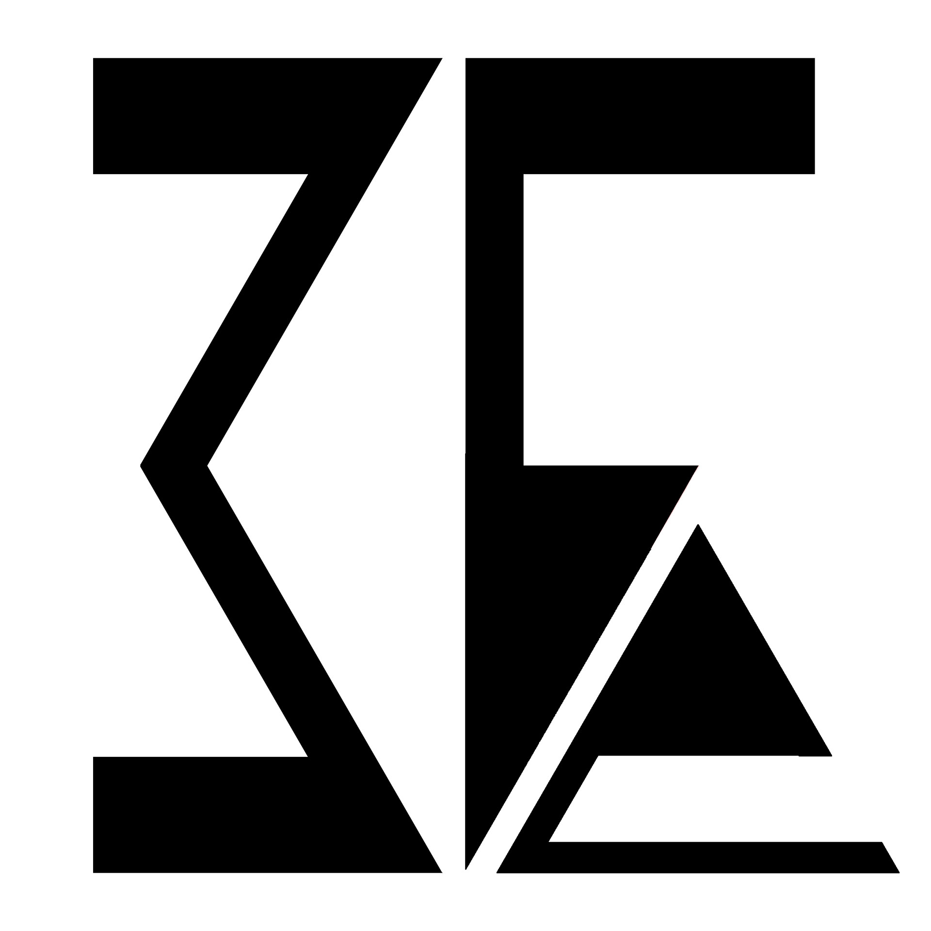
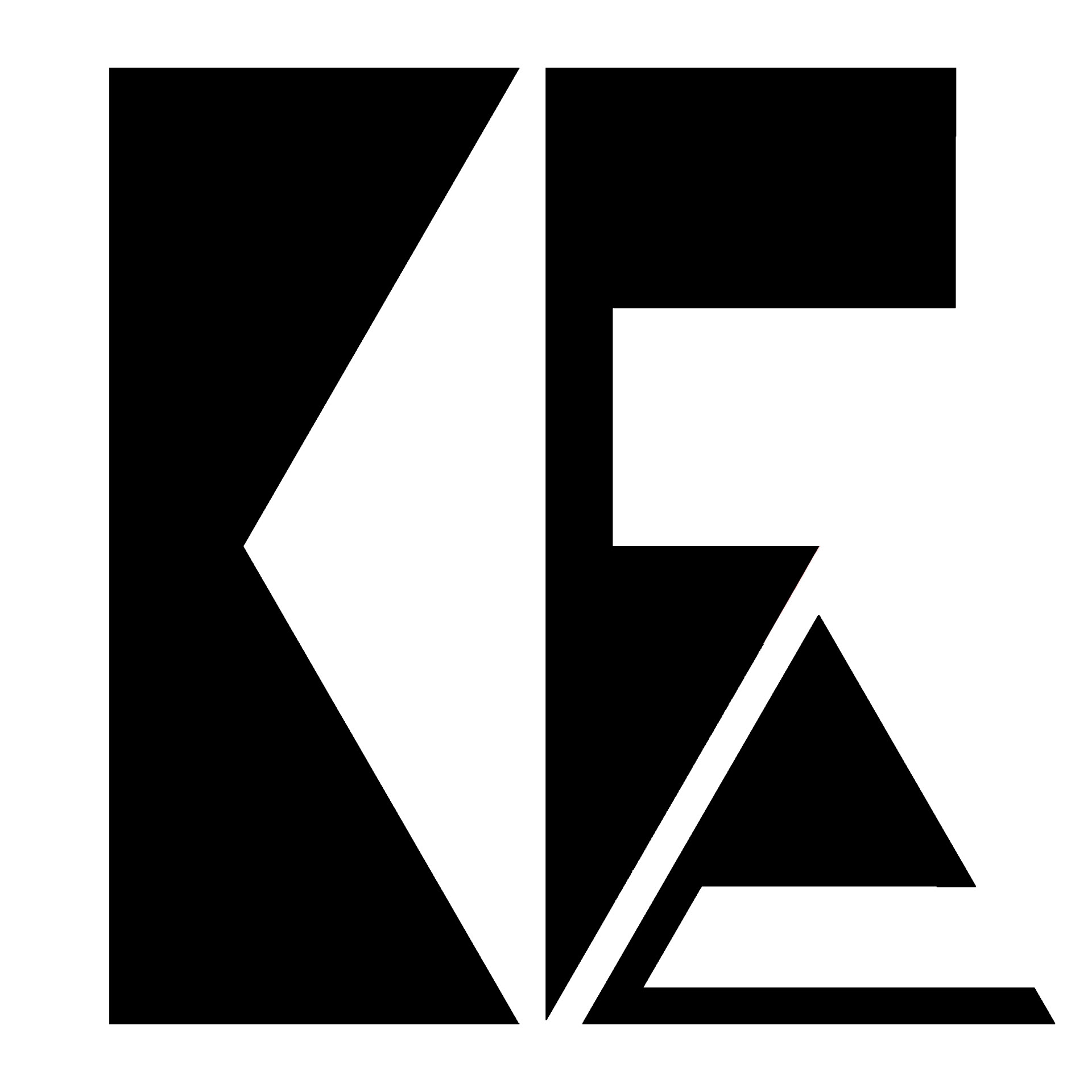
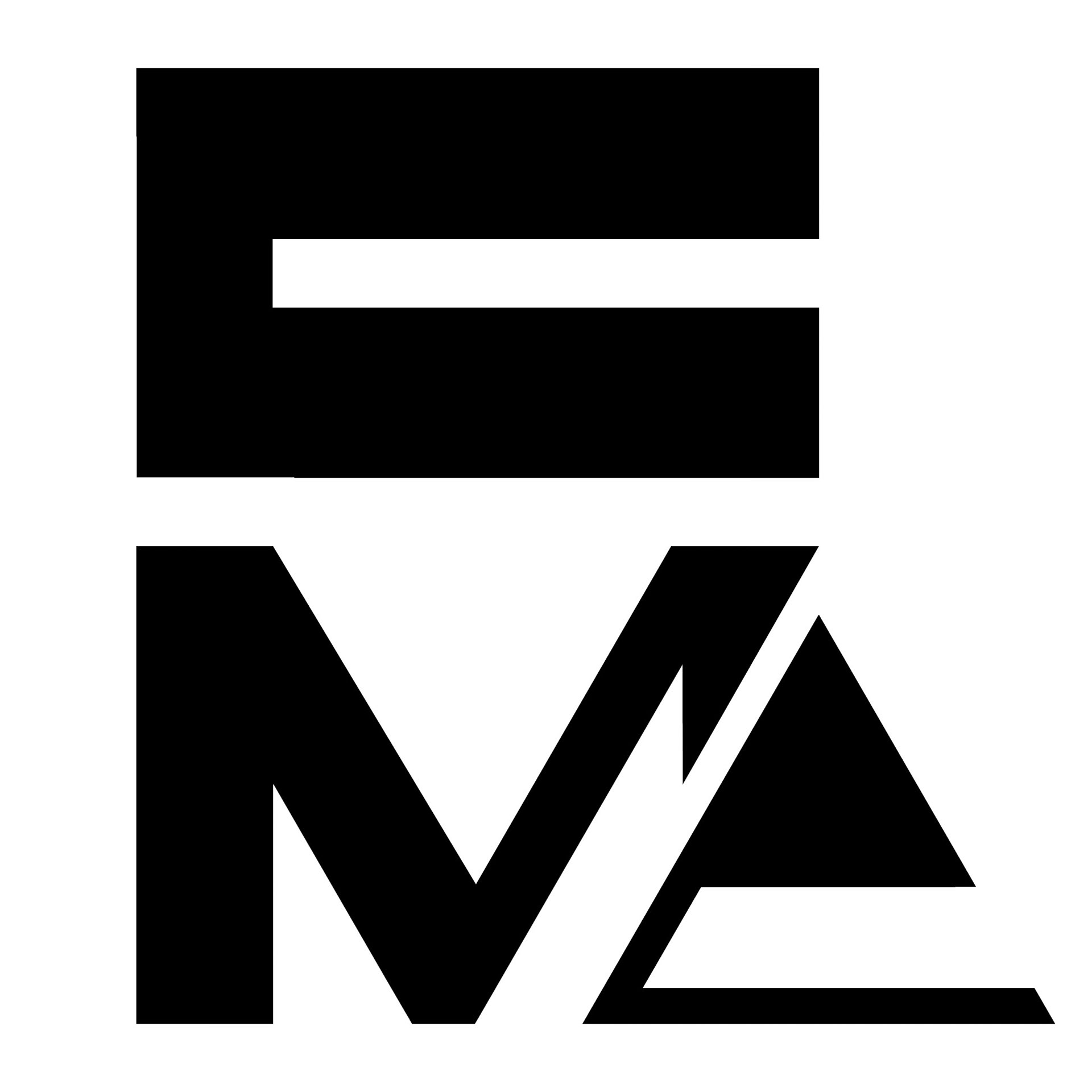
Version A "M-downstrike" completes the M, where missing this denotes a V
A heavier version of the Cutout with the "downstrike" may be interesting to explore
Solid Angle, Cutout Medium, Cutout Heavy generated to show a "C" rather than a "G"
A heavier version of the Cutout with the "downstrike" may be interesting to explore
Solid Angle, Cutout Medium, Cutout Heavy generated to show a "C" rather than a "G"
Losing angled elements in the letters makes the logo more defined and foundational, but removes an atmosphere of dynamic movement. The clearly defined M, C, and delta aid the logo's clarity.
05 May 2020
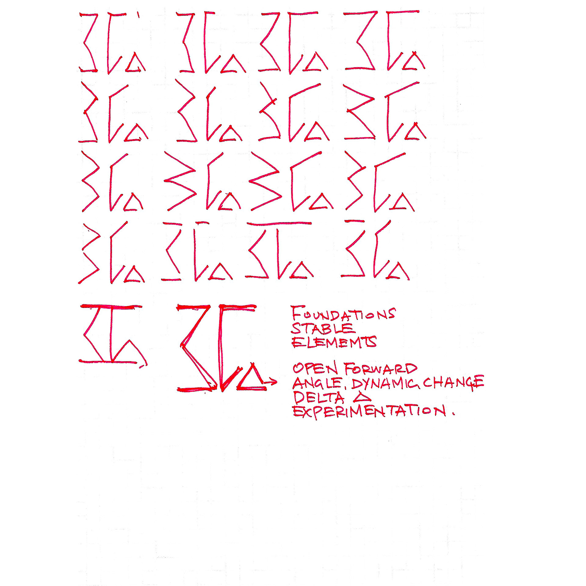
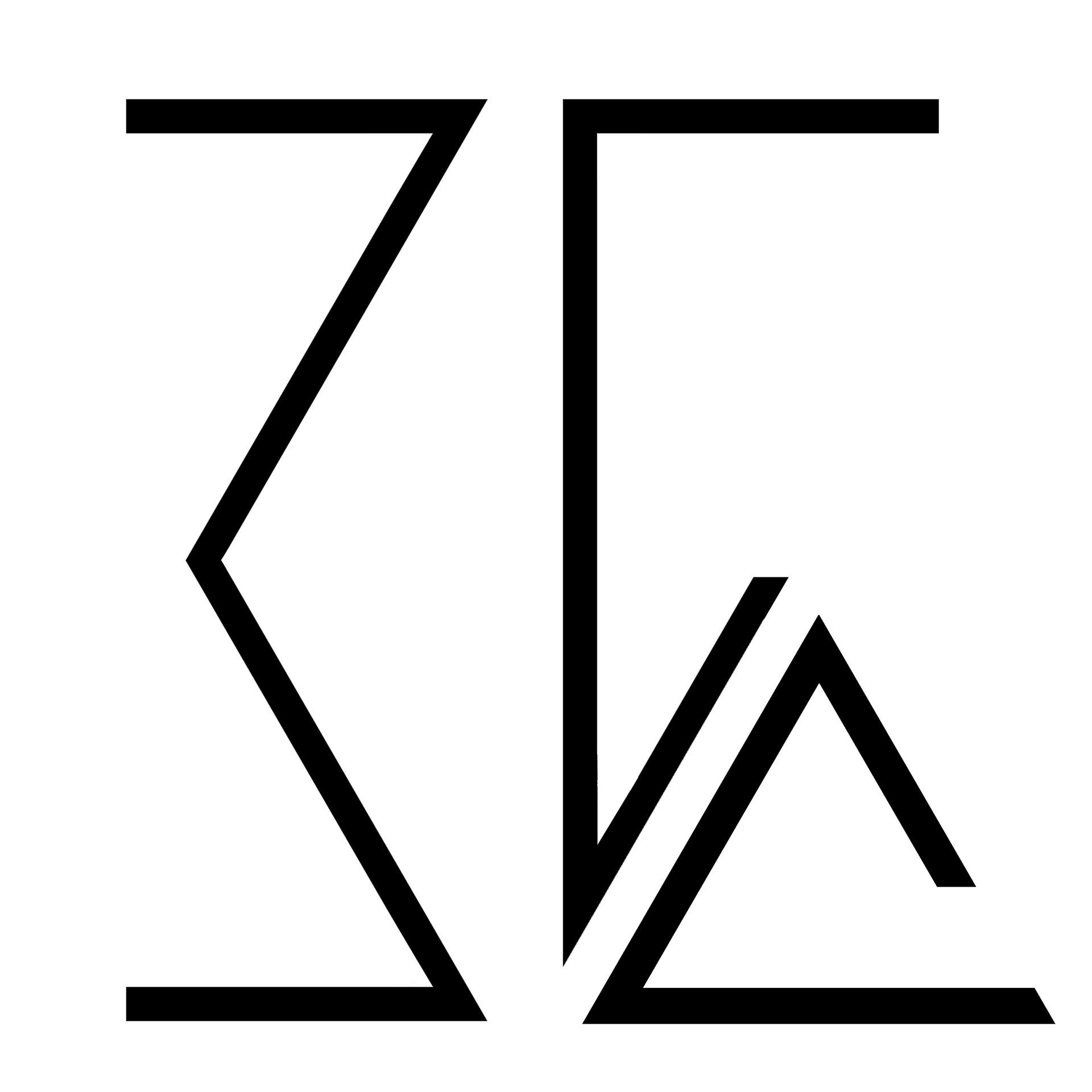
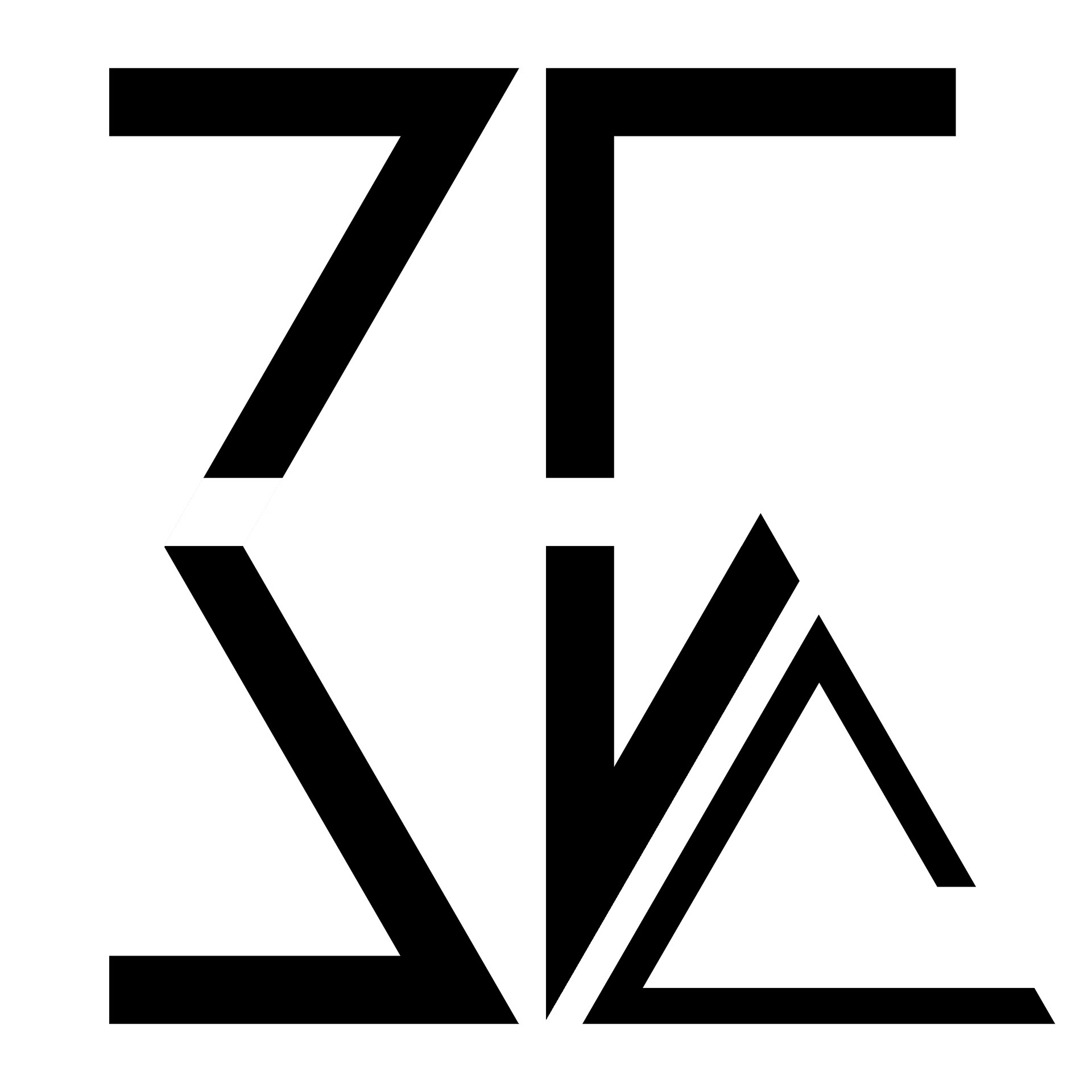
A revised design combining elements of the CJK and ISO Latin
The (弓) 'gong' text is a sideways 'M'
The (長) 'chang' text is a 'C' implementing the 'delta' symbol
The (弓) 'gong' text is a sideways 'M'
The (長) 'chang' text is a 'C' implementing the 'delta' symbol
Broad horizontals indicate a strong foundation
Angled elements develop the icon as a dynamic set
An implied diamond is created in the central space, the process of refinement through pressure
The delta invites openings, the process of change through new ideas
Angled elements develop the icon as a dynamic set
An implied diamond is created in the central space, the process of refinement through pressure
The delta invites openings, the process of change through new ideas
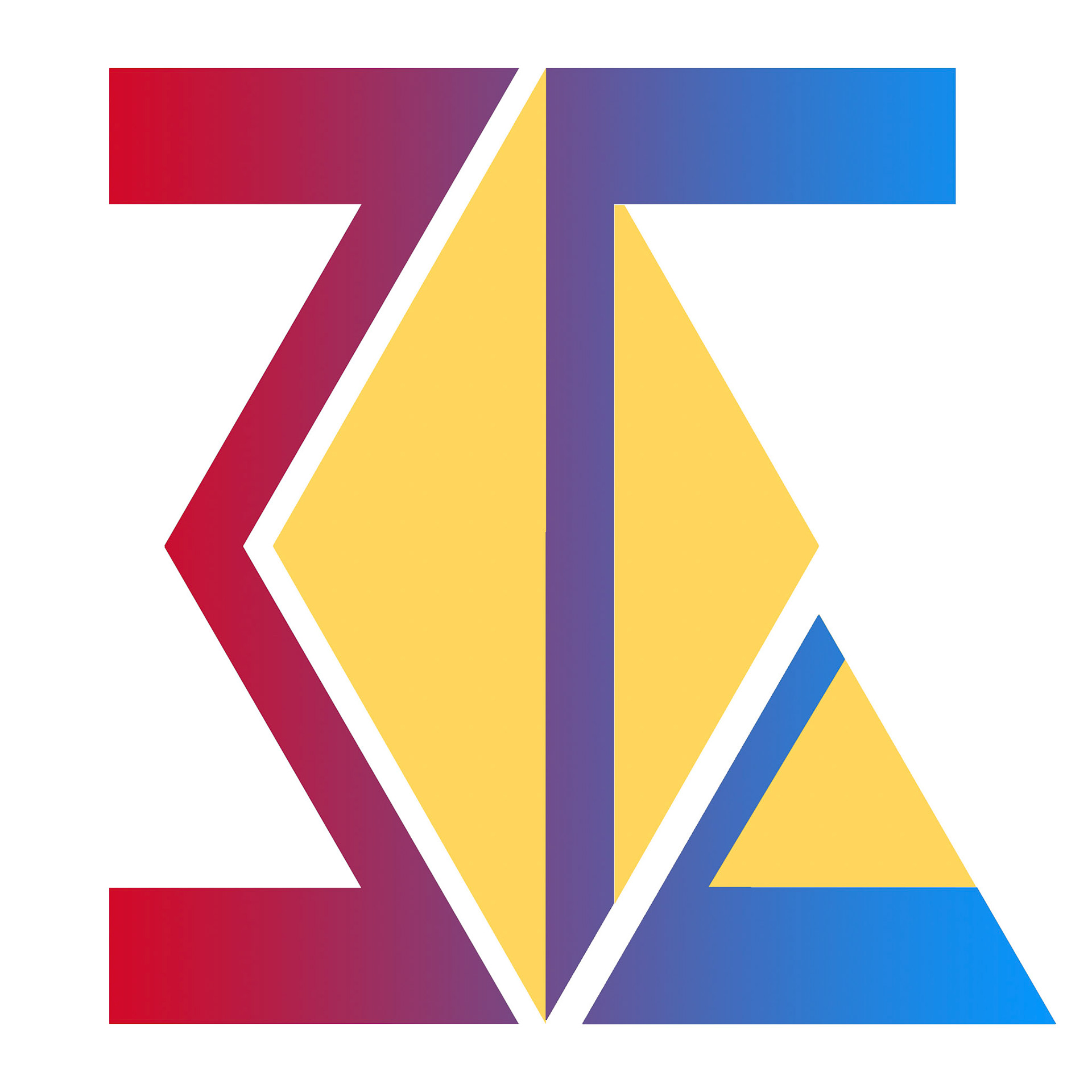
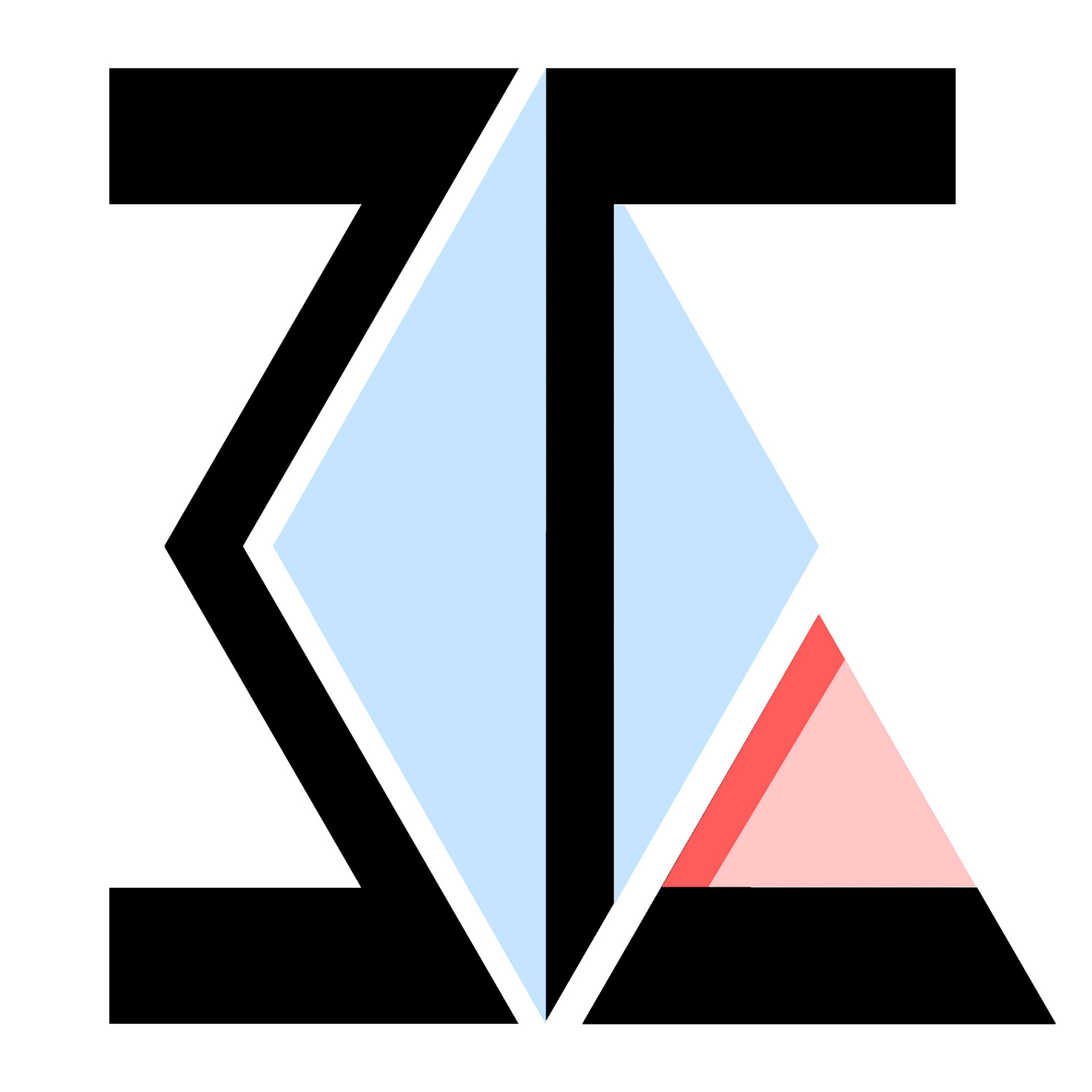
Experimentation with colour using primary colours, elements of secondary colours
Text to use bolder colours/shades, the implied space to use lighter colours
Text to use bolder colours/shades, the implied space to use lighter colours
20 May 2020
Return to exploration with Latin typology.
An exploration with colour, balance, and positive / negative space.
An exploration with colour, balance, and positive / negative space.
27 May 2020
Flipping the vertical axis of the Latin typology.
Some of the original design meaning rearranged for a more vertically balanced arrangement.
Instead of the 'Delta' as a punctuation point, the 'C' now serves as a foundational element.
With the foundational element at the bottom, the typology is less bold.
Some of the original design meaning rearranged for a more vertically balanced arrangement.
Instead of the 'Delta' as a punctuation point, the 'C' now serves as a foundational element.
With the foundational element at the bottom, the typology is less bold.
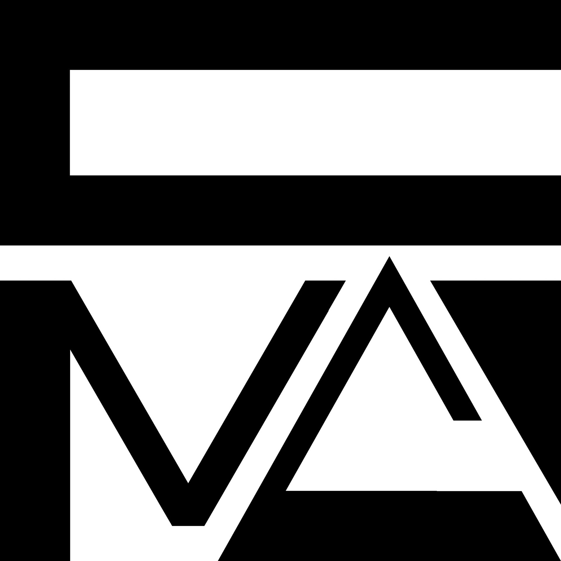
Rotated, the perspective of 'M' as 'Sigma' begins to fade.
As the 'C' is so obvious, there is some justification on making the 'M' more explicit.
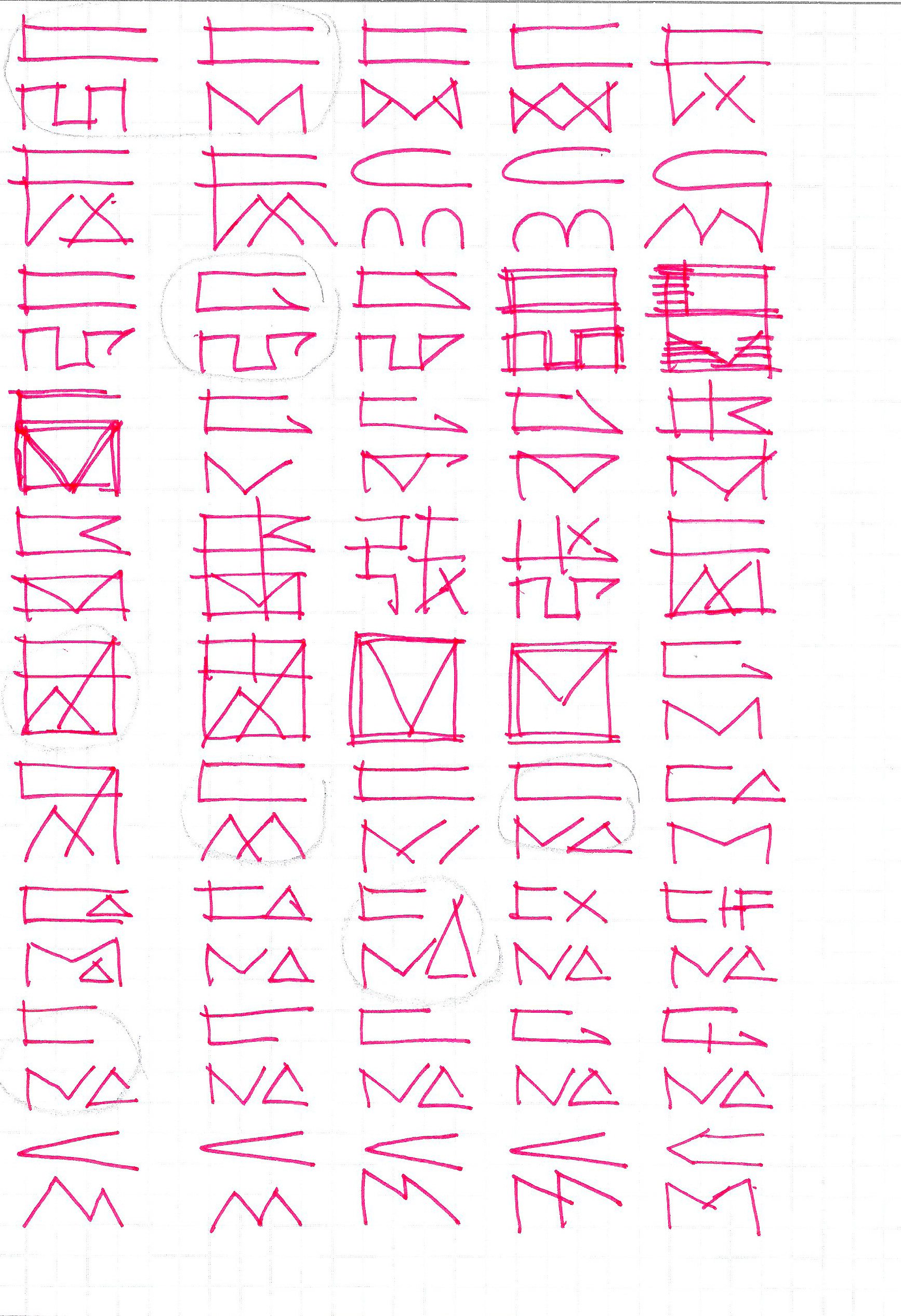
03 June 2020
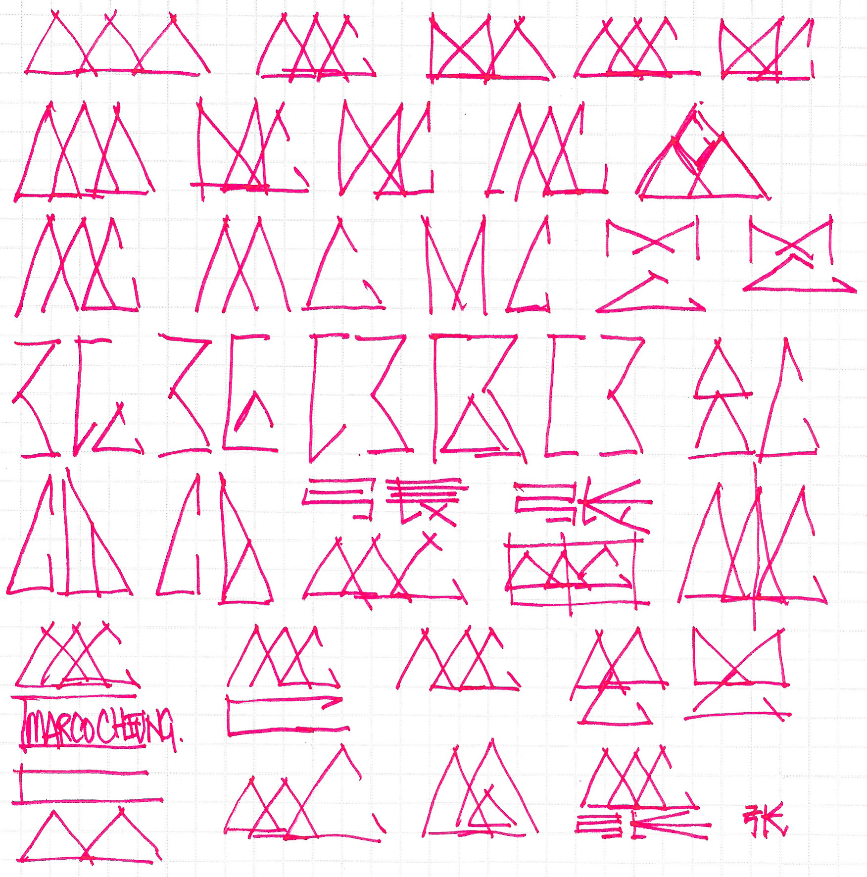
Exploration along a third path.
The first exploration resulted in a symbolic form, portrayal in lines.
The second exploration resulted in a iconic form, portrayal in arrangement.
The second exploration resulted in a iconic form, portrayal in arrangement.
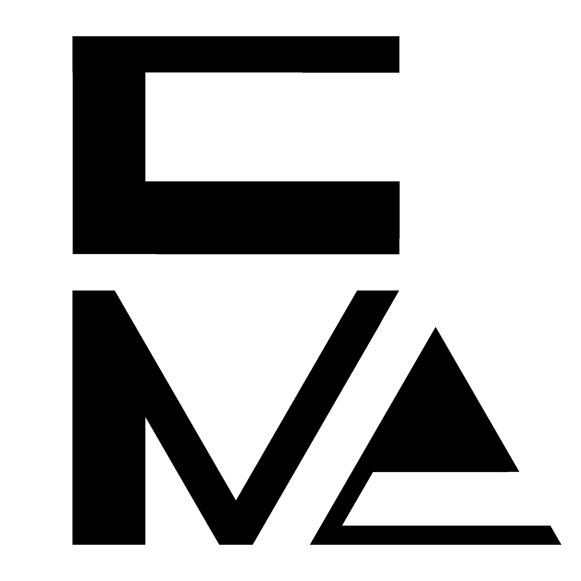
This third exploration demonstrates a simple form of the triangle (delta), and aims to integrate the Latin explicit 'M' and 'C', while maintaining the duality of the CJK left-right parts (arranged top-bottom). The CJK heritage is also utilized in the usage of the 3-character name as 3 shapes.
A text-less variation creates a field that could re-host text, or remain empty.
The line and point create a distinct 'punctuation' point, and introduces an 'opening' into the bottom of the arrangement. In combination with the field, it also demonstrates architectural elements such as 'point', 'line', and 'plane. The whole is also reminiscent of a river, field, and mountain range.
The line and point create a distinct 'punctuation' point, and introduces an 'opening' into the bottom of the arrangement. In combination with the field, it also demonstrates architectural elements such as 'point', 'line', and 'plane. The whole is also reminiscent of a river, field, and mountain range.
An open 'M' and 'C' creates a 'weaving' intent, while closed creates a foundational symbol with recognizable shapes.

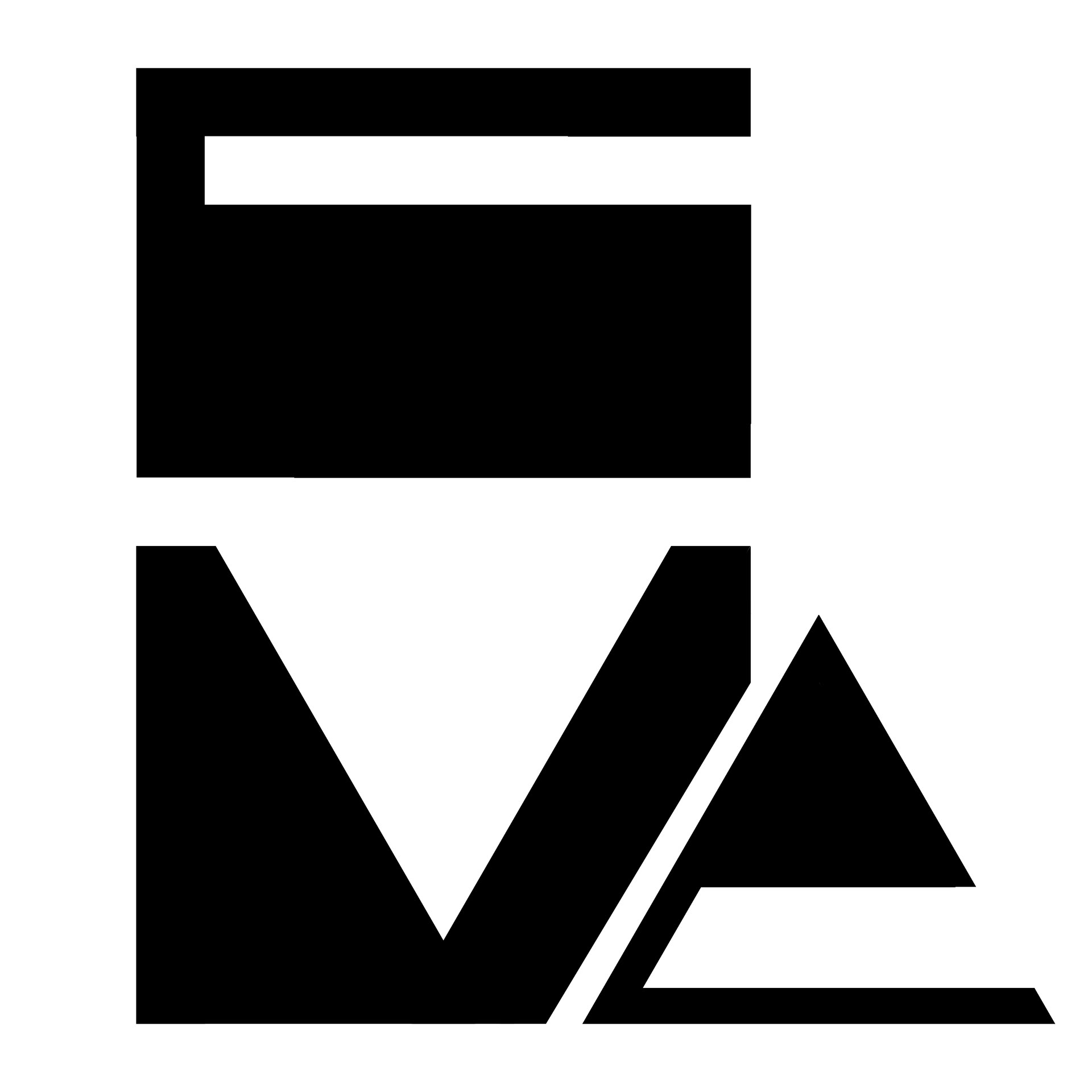
10 June 2020
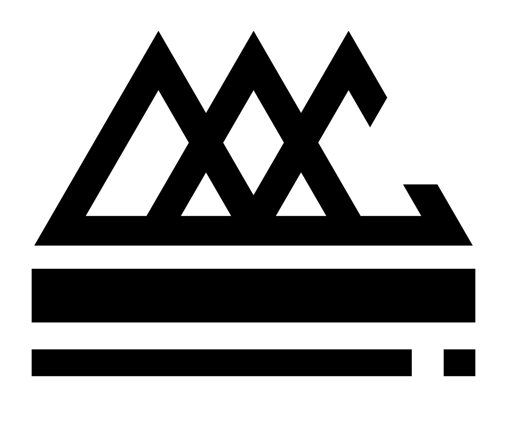
Refinement exploring the 'Delta Gap' and colour


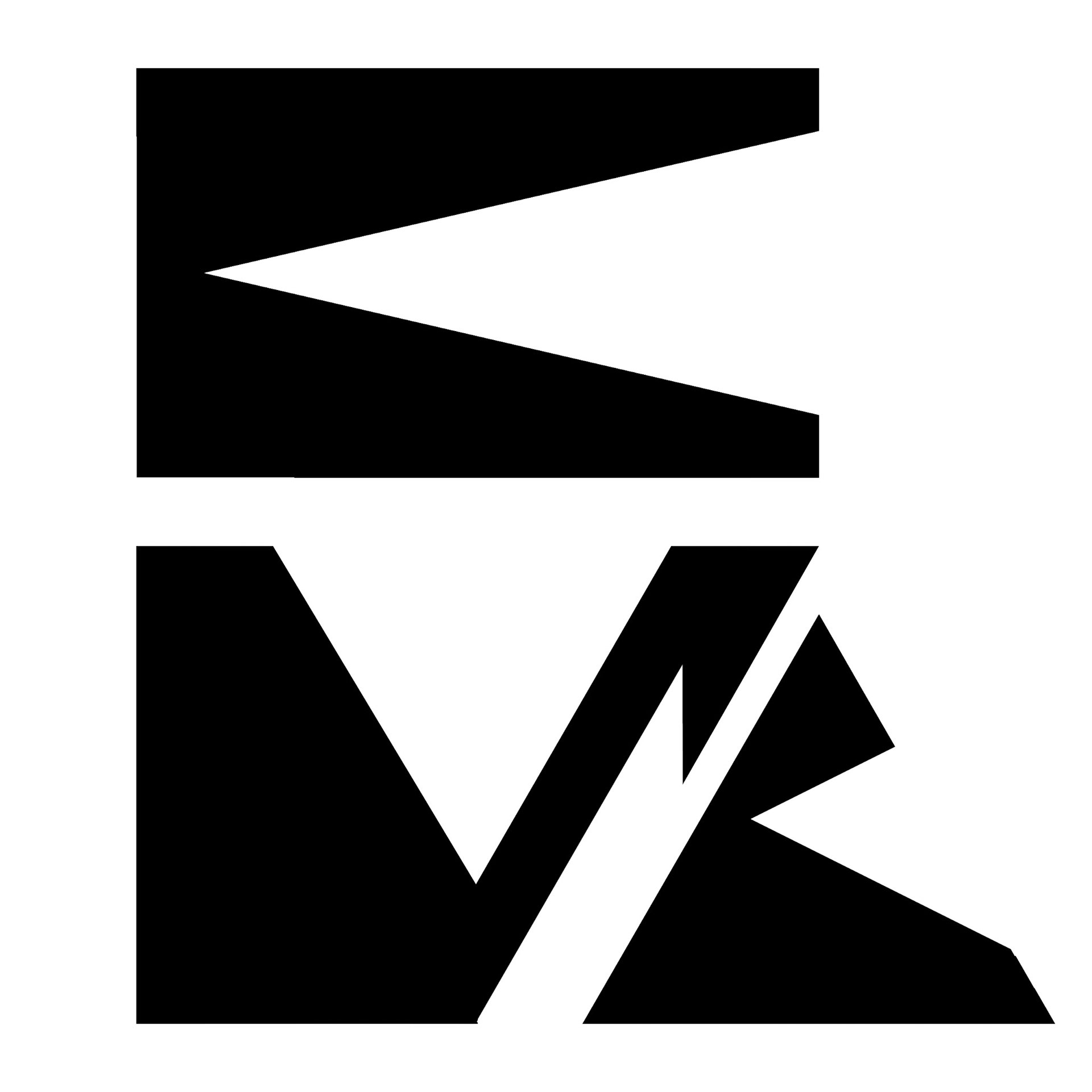
17 June 2020
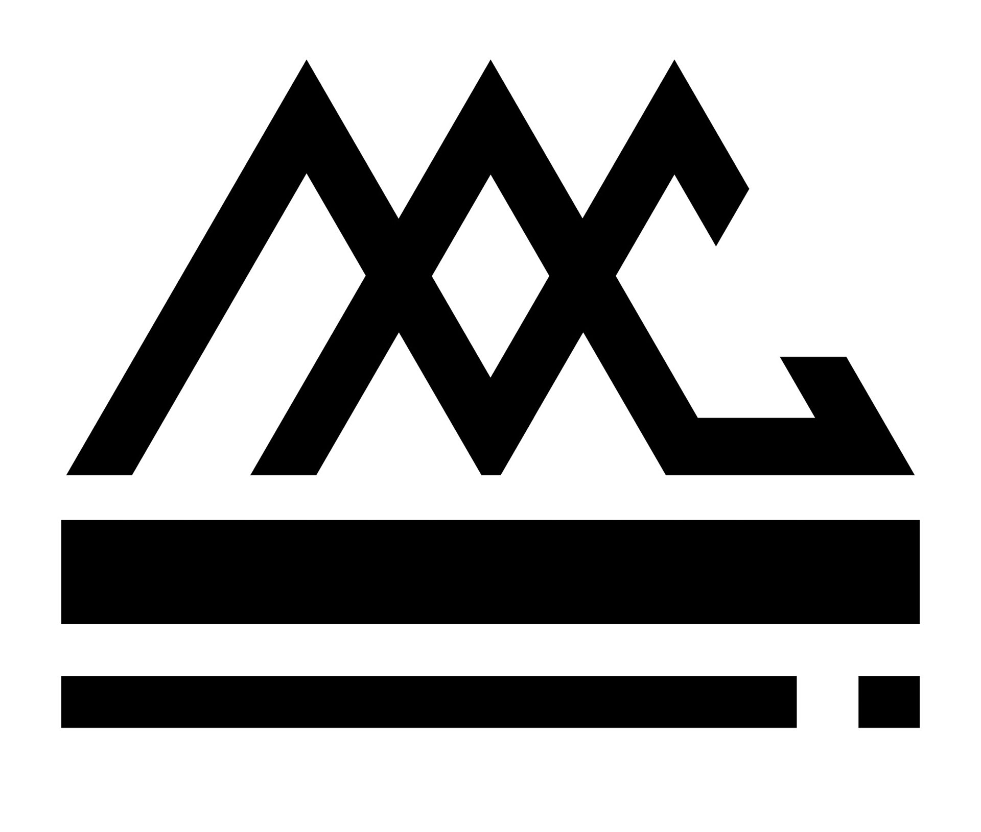
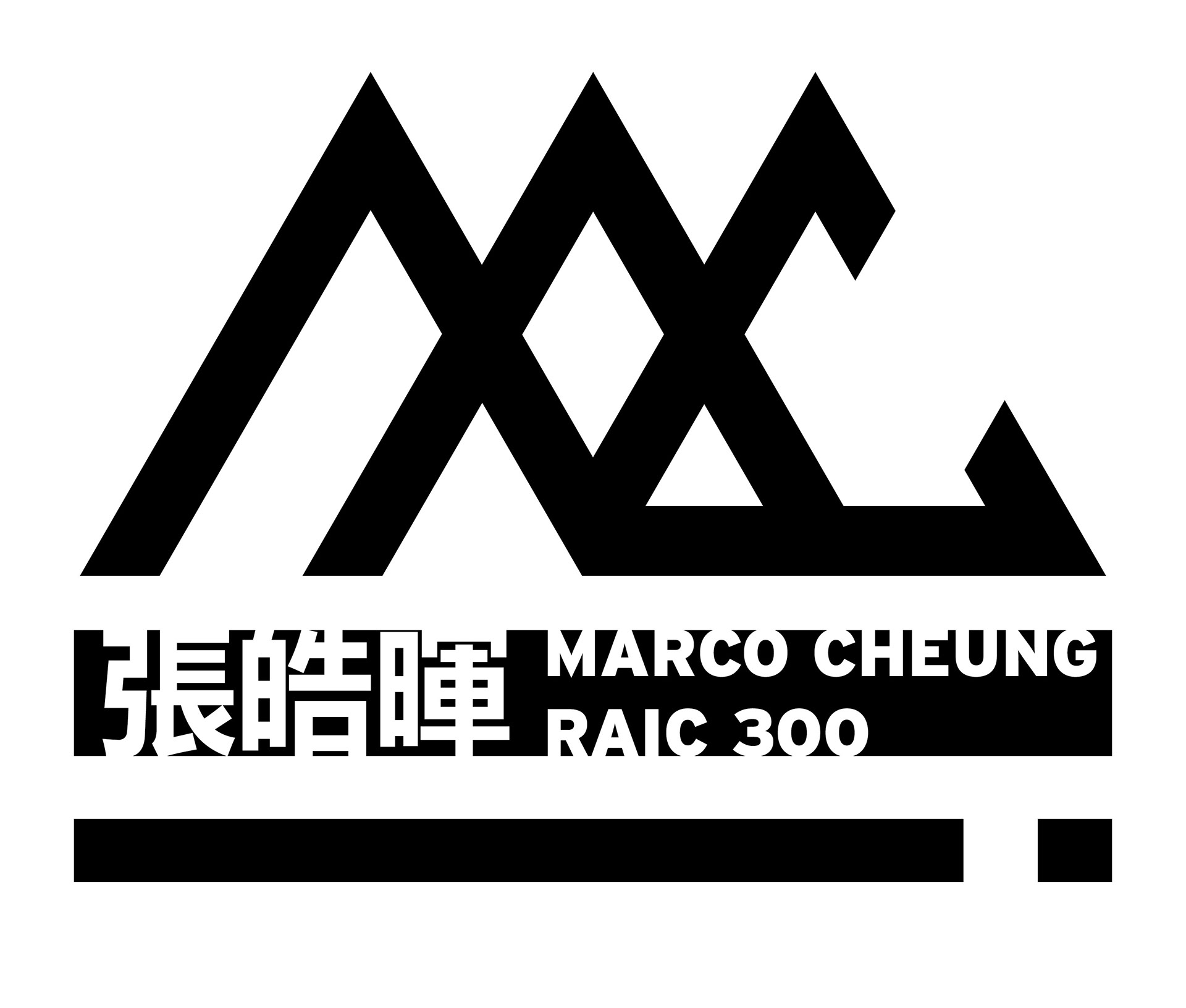
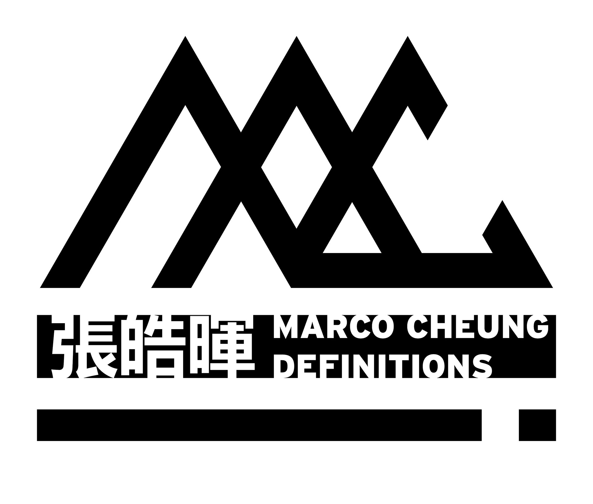
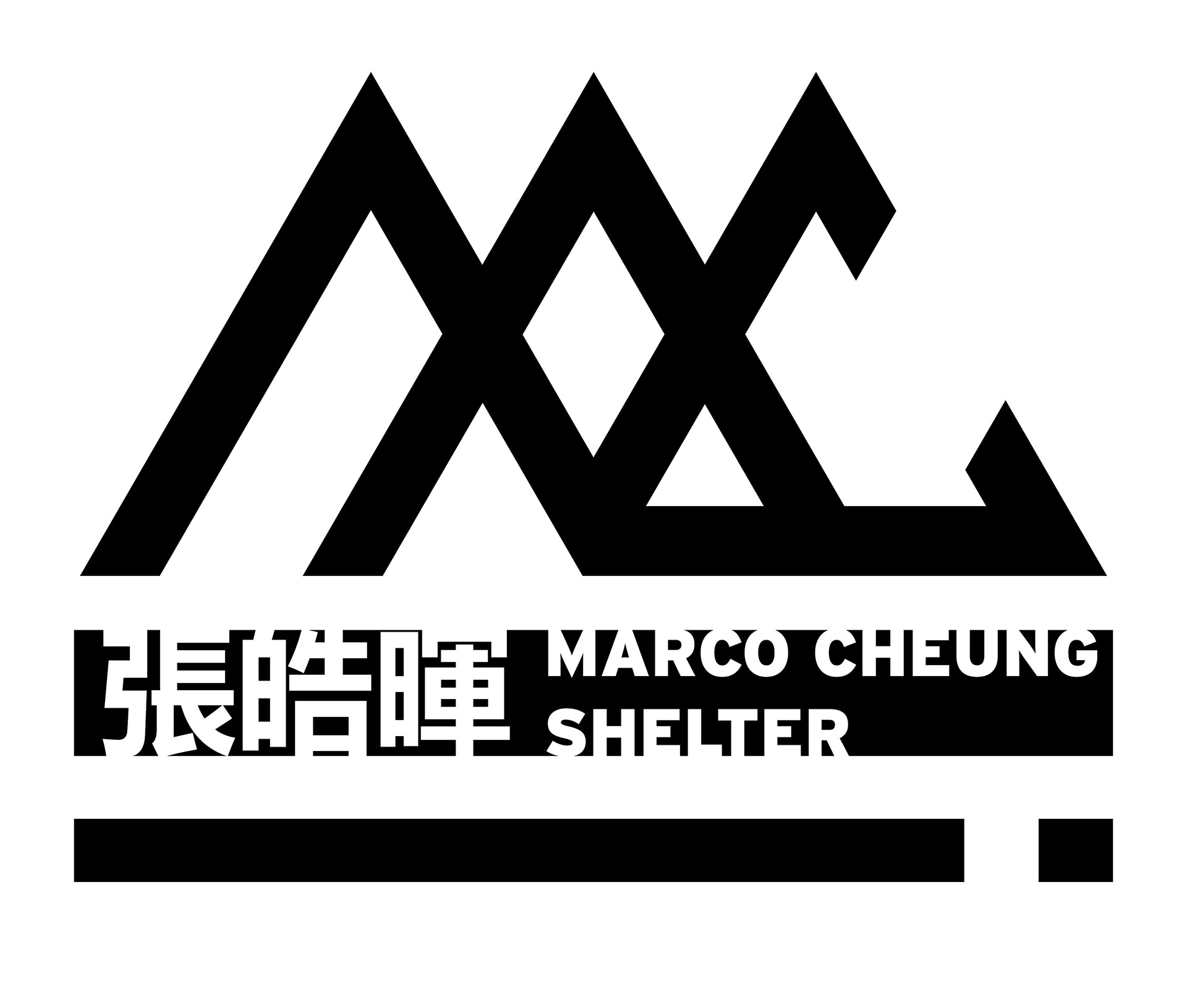
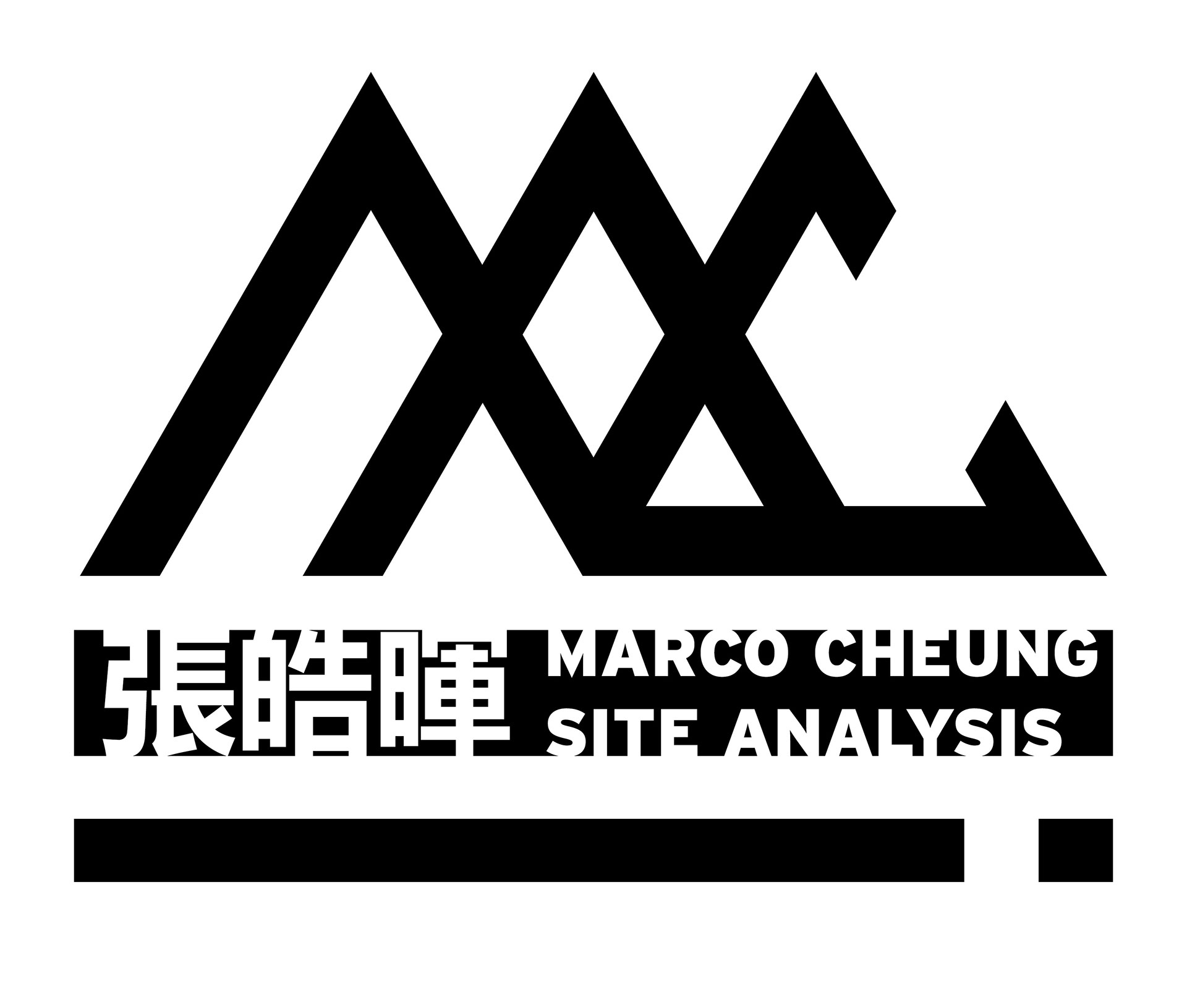
Adjusting the field to avoid legal conflicts, as well as demonstrating the field as space for subtitles.


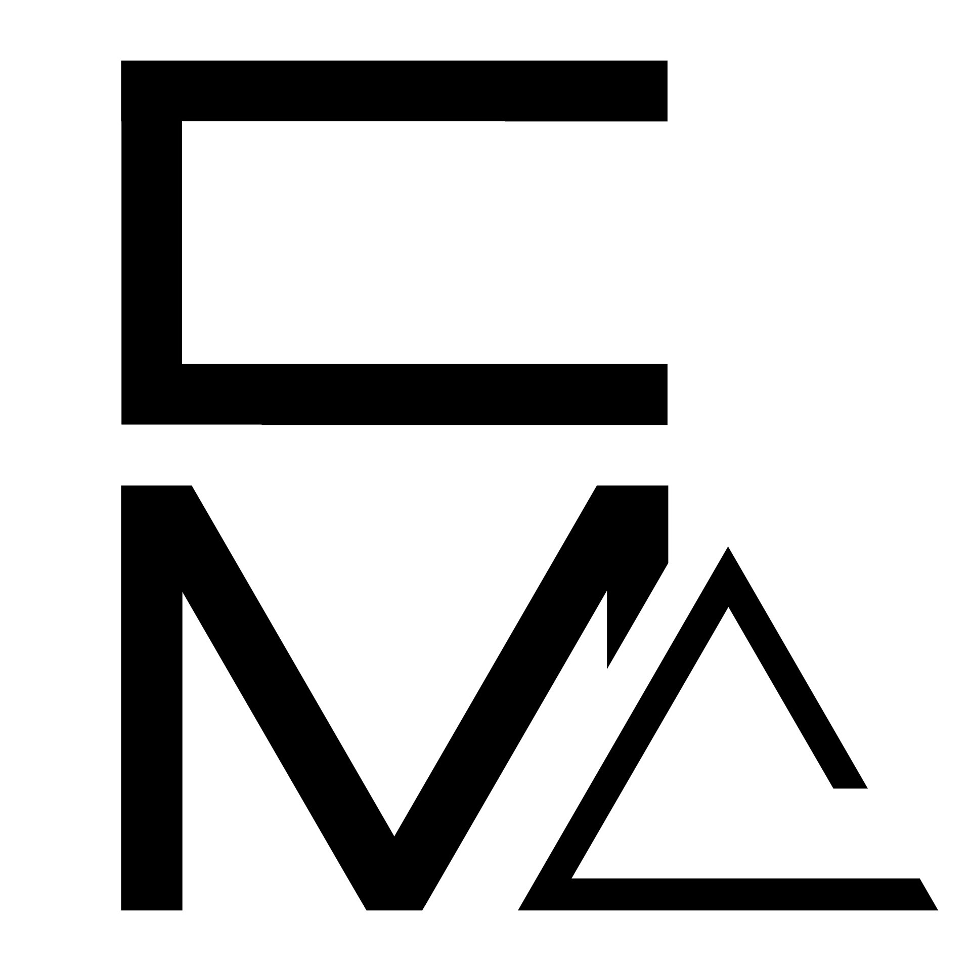
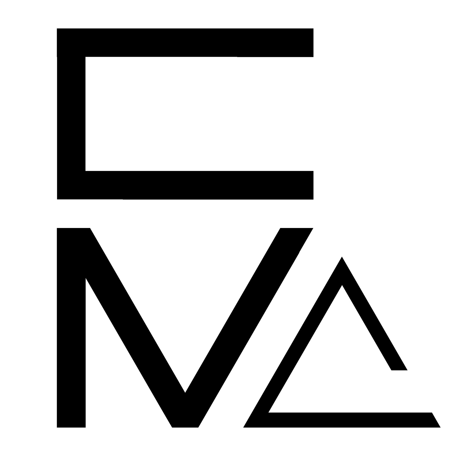
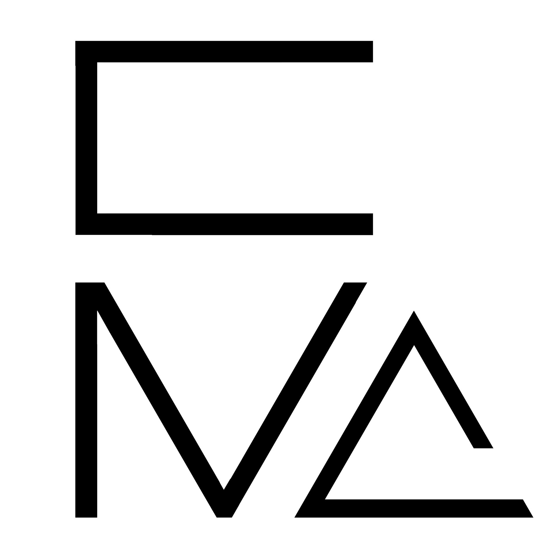
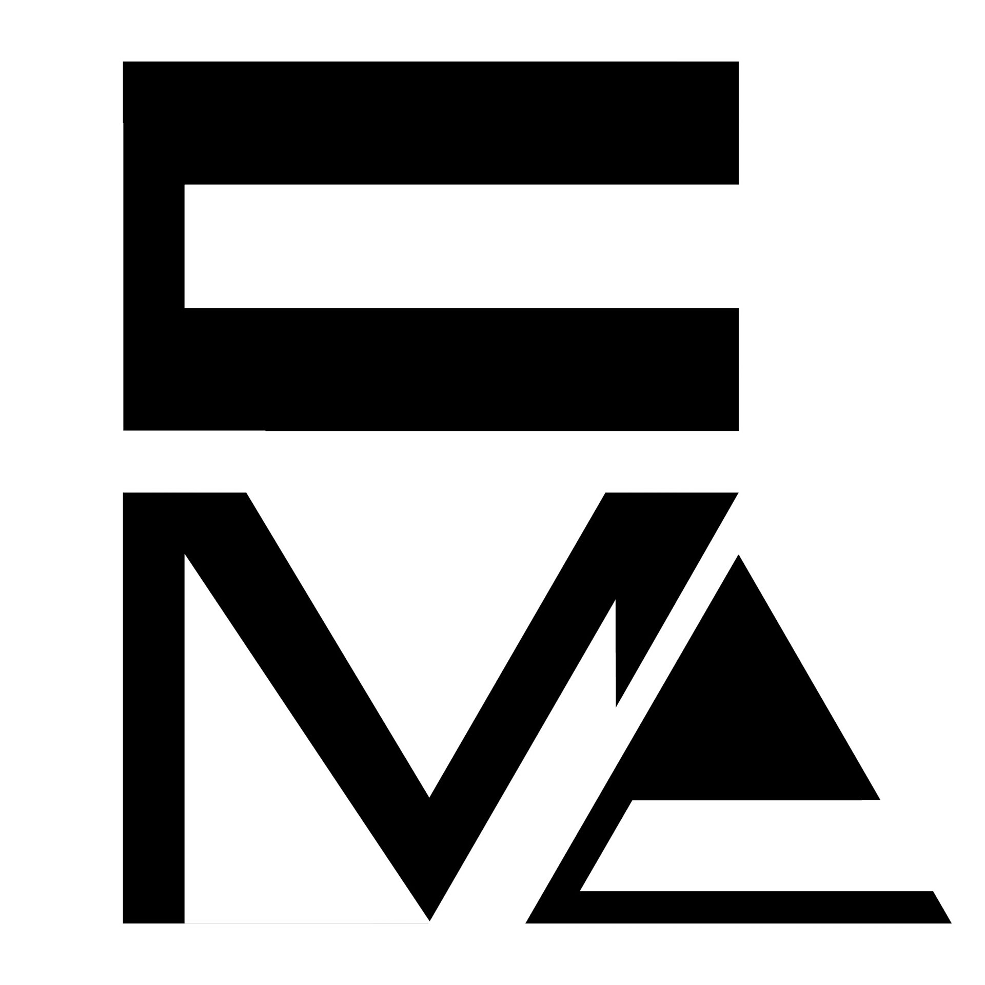
23 June 2020
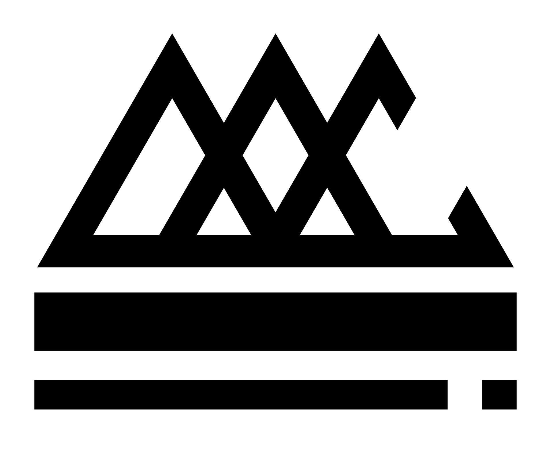
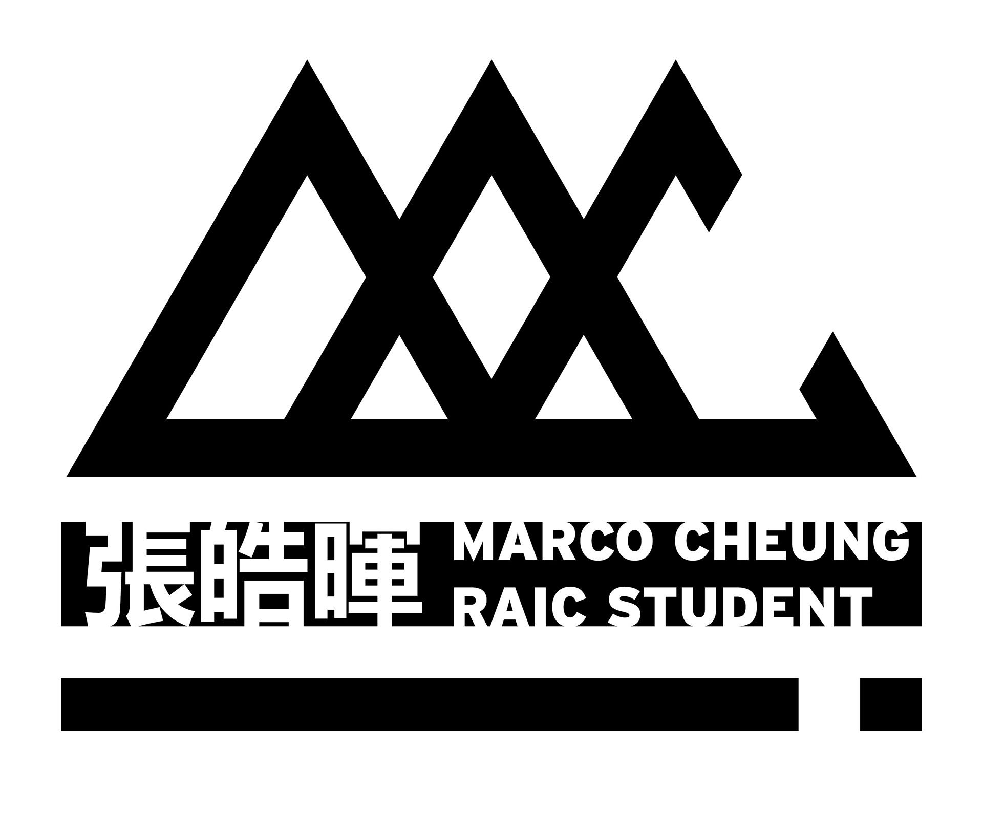
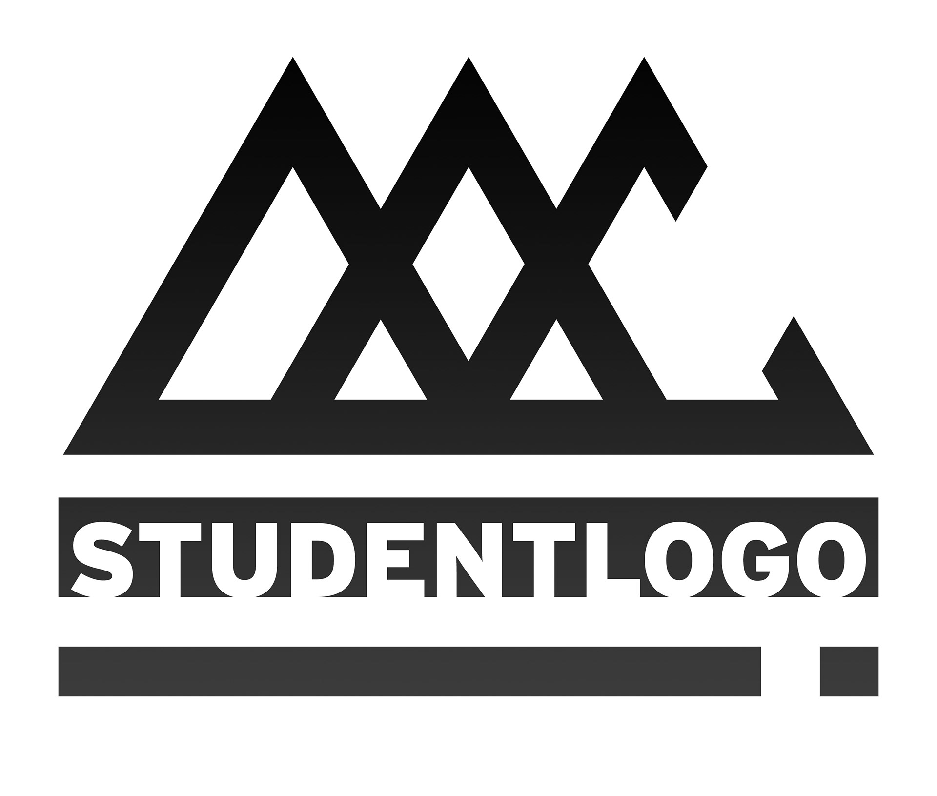
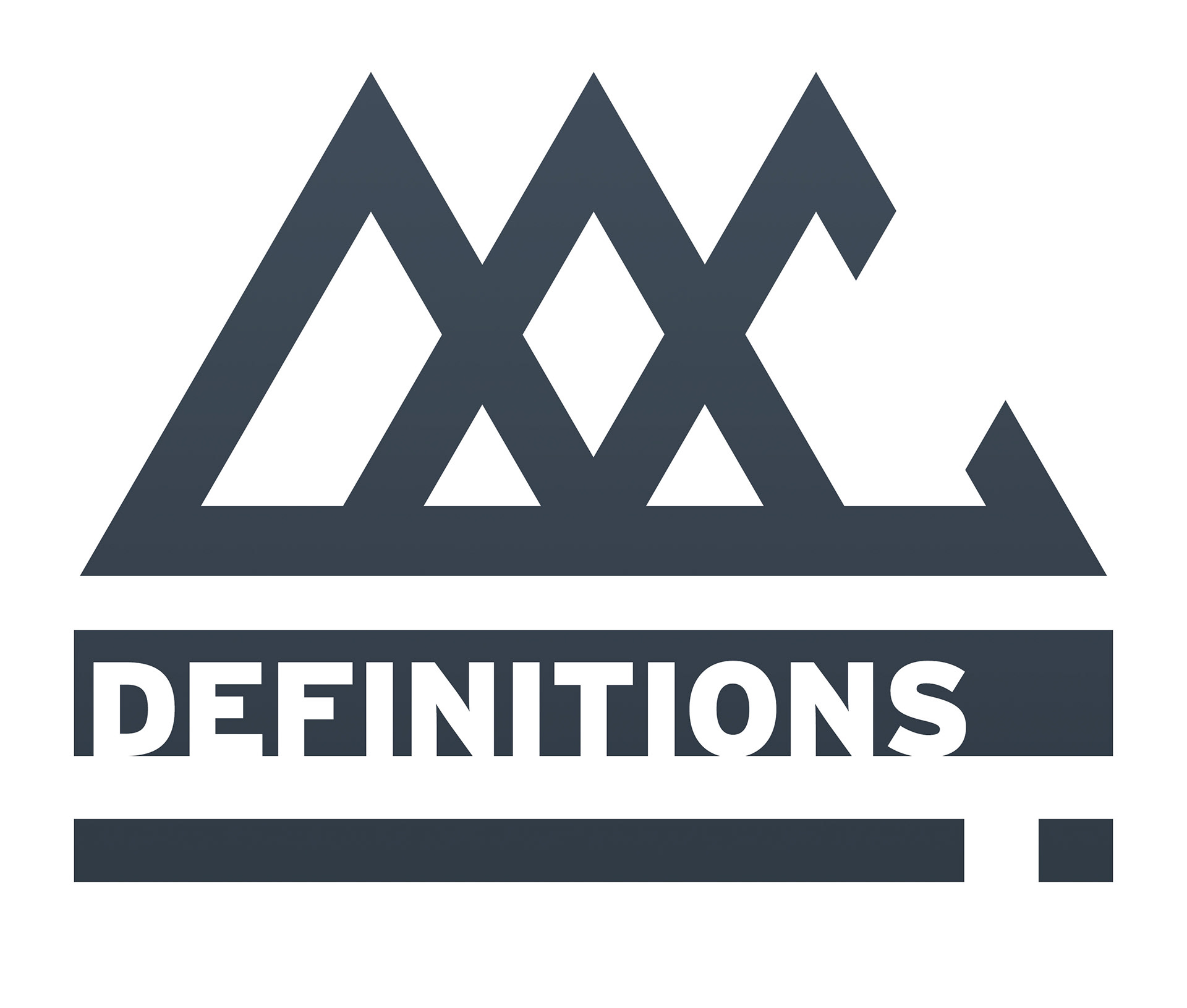
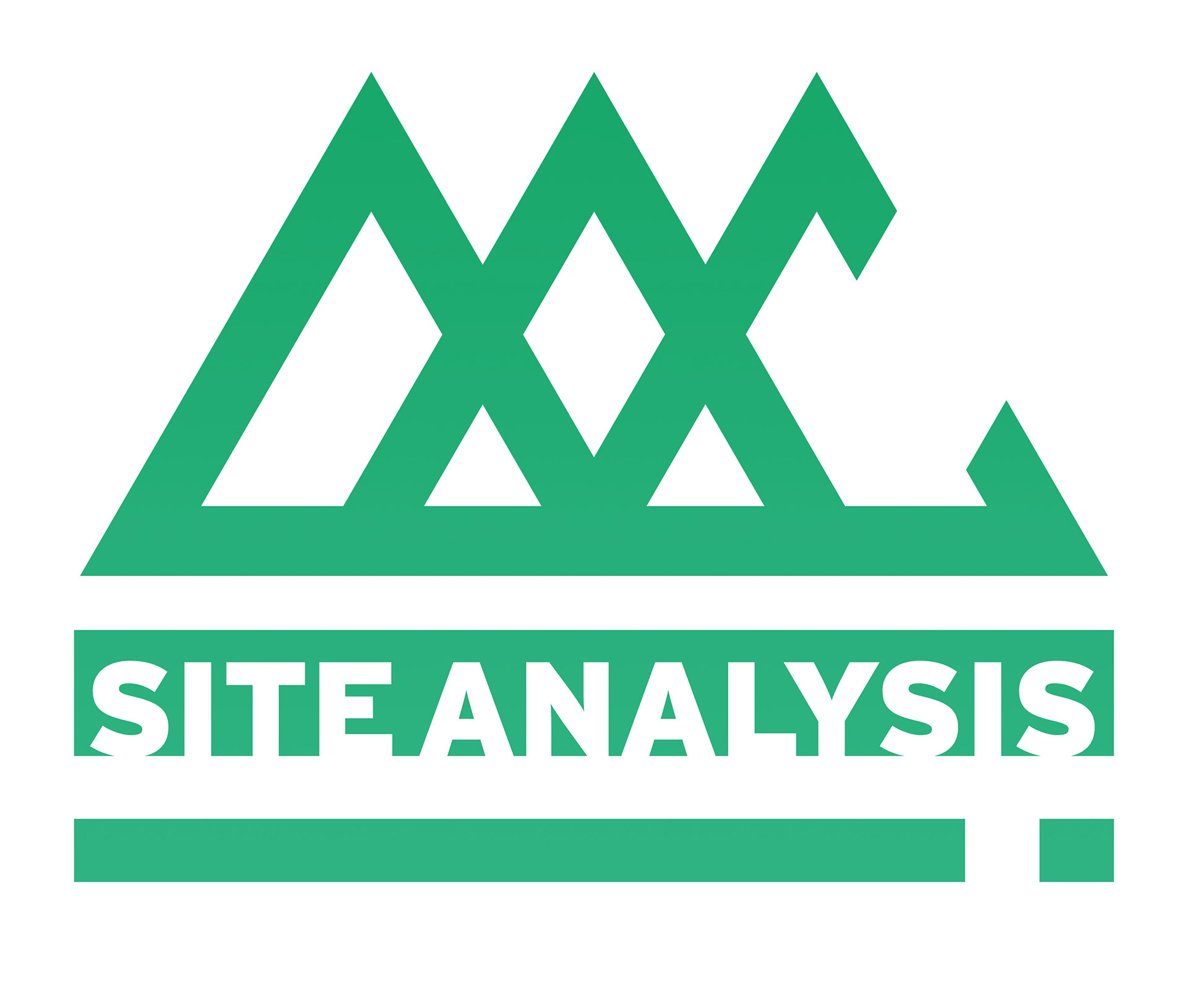
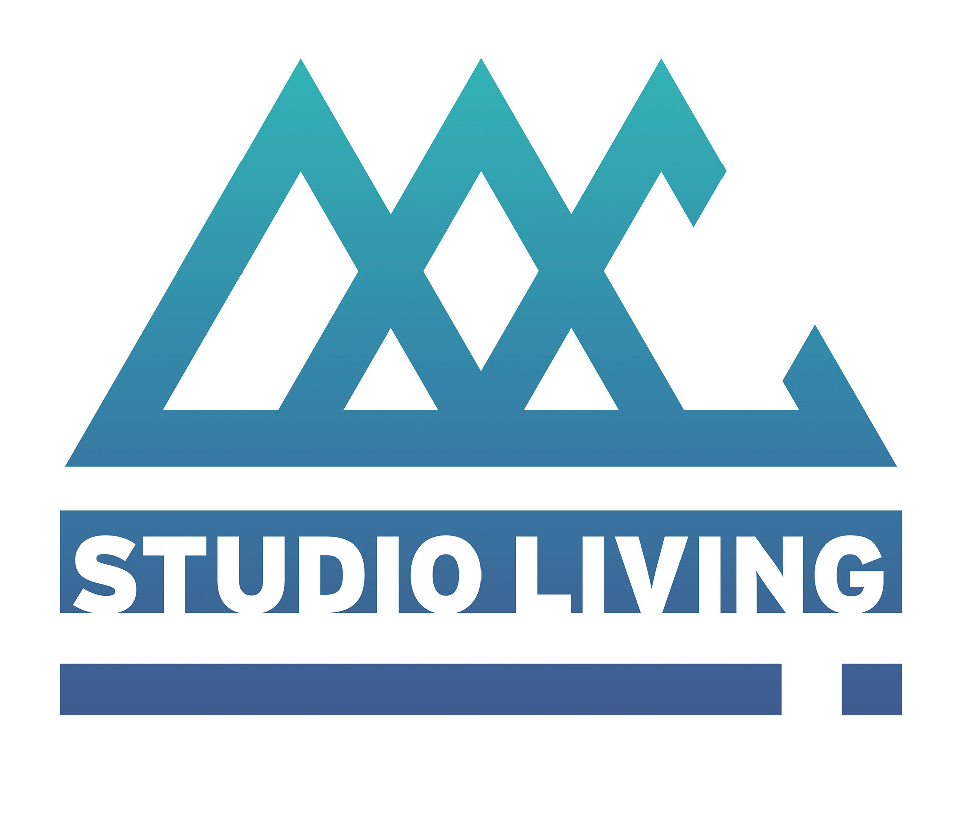
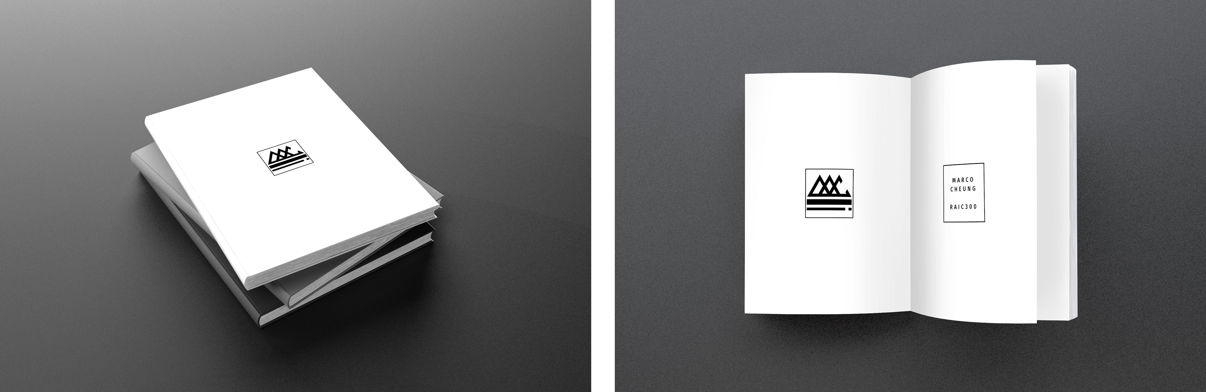
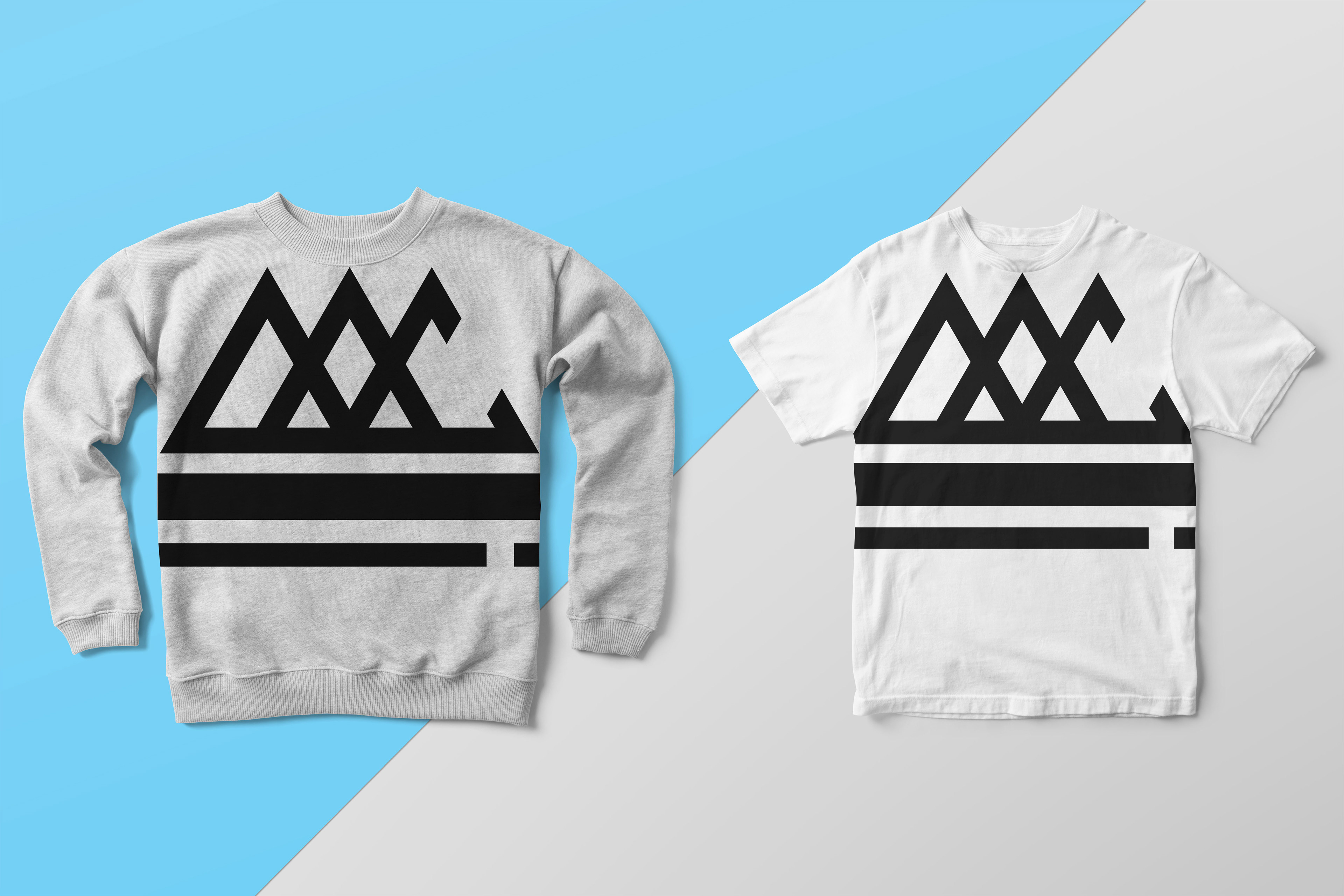
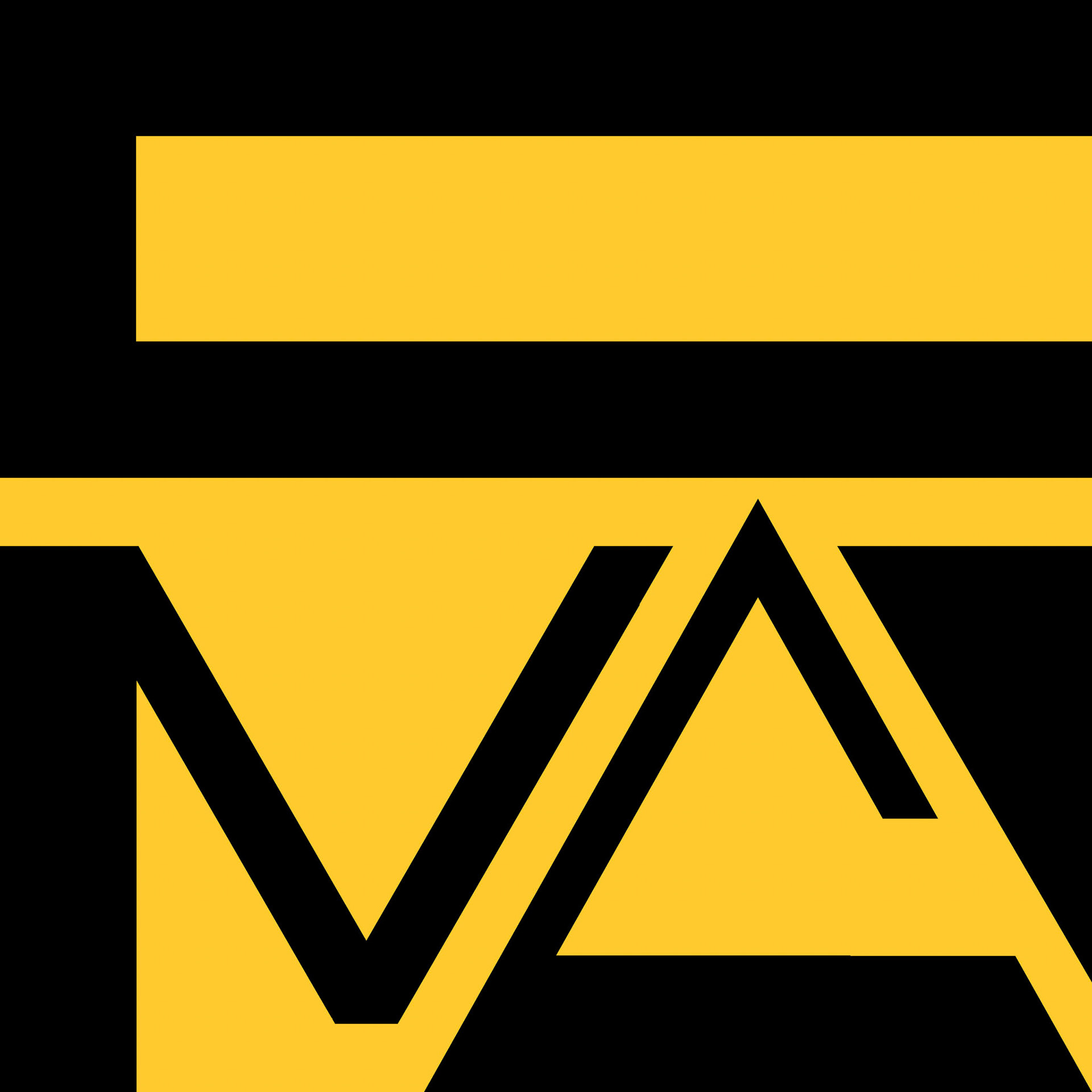
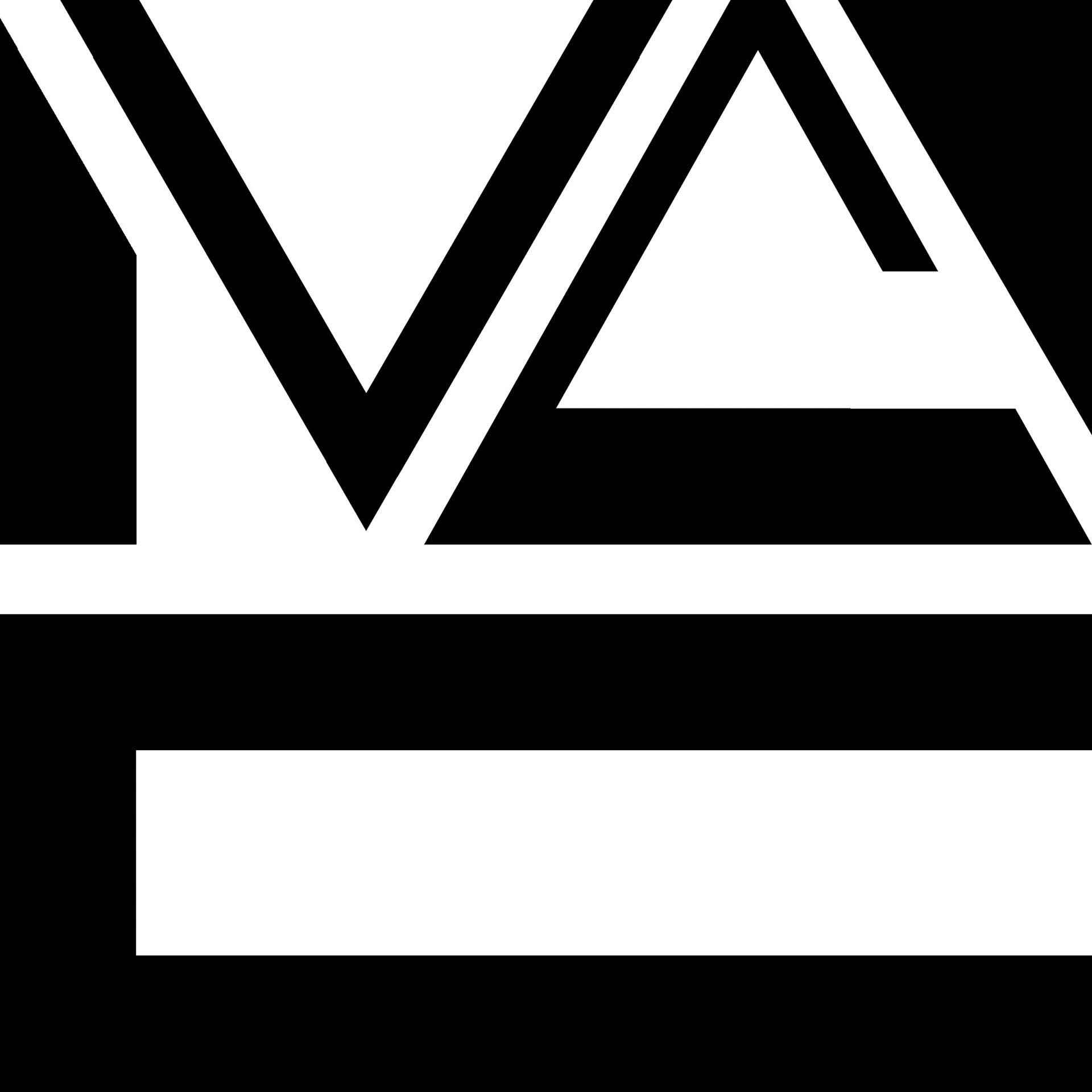
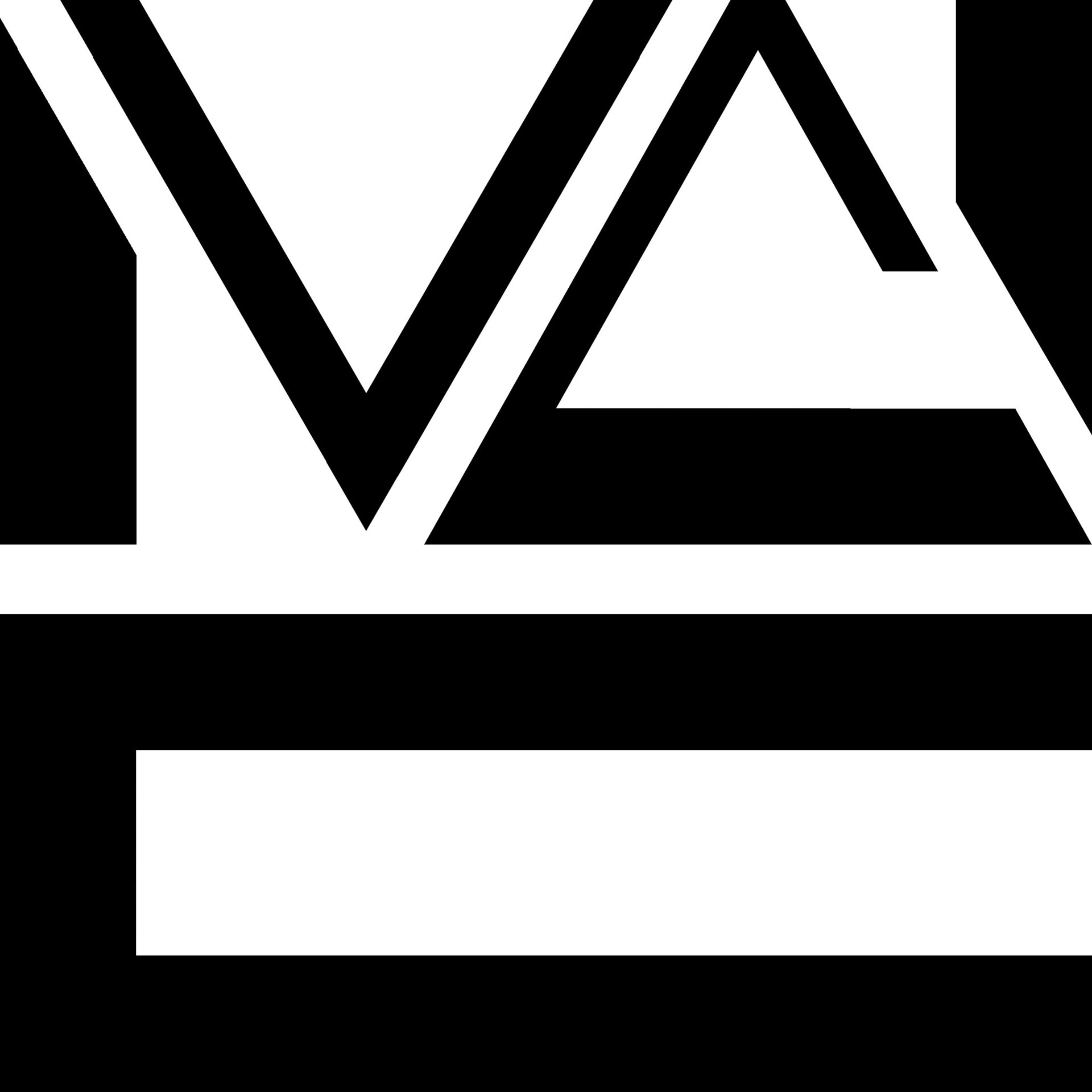
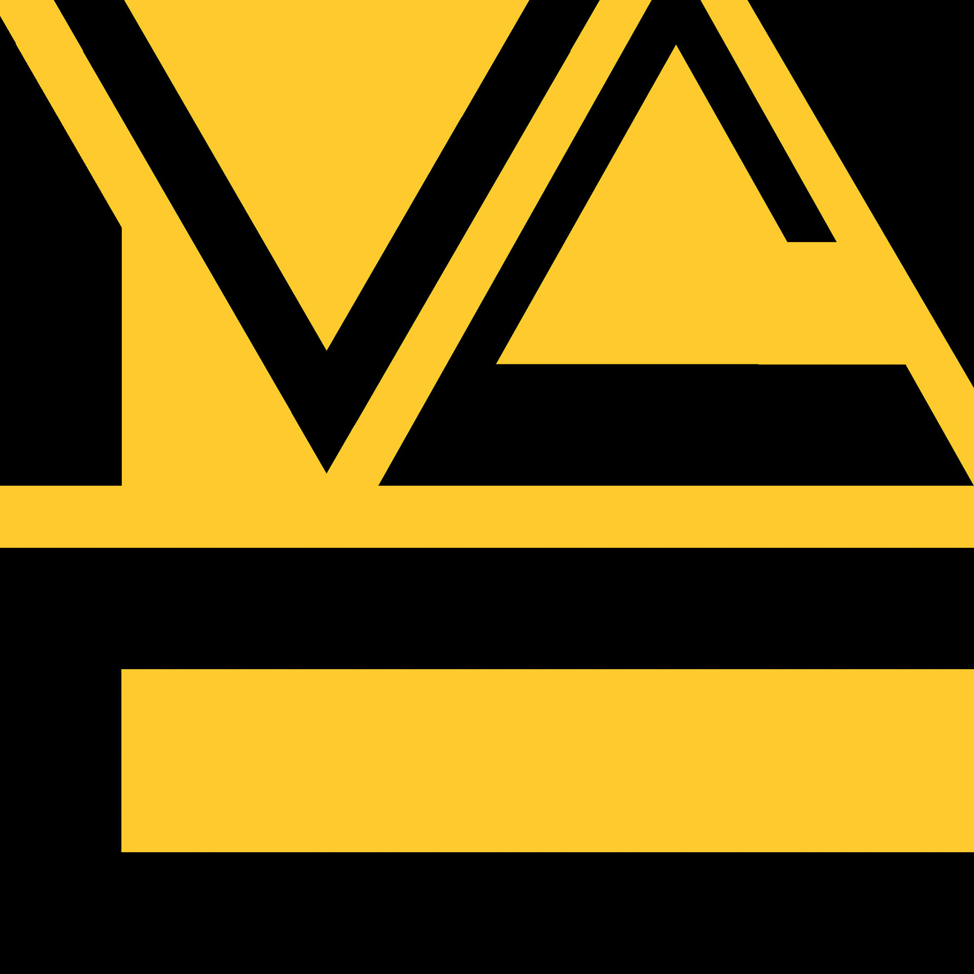
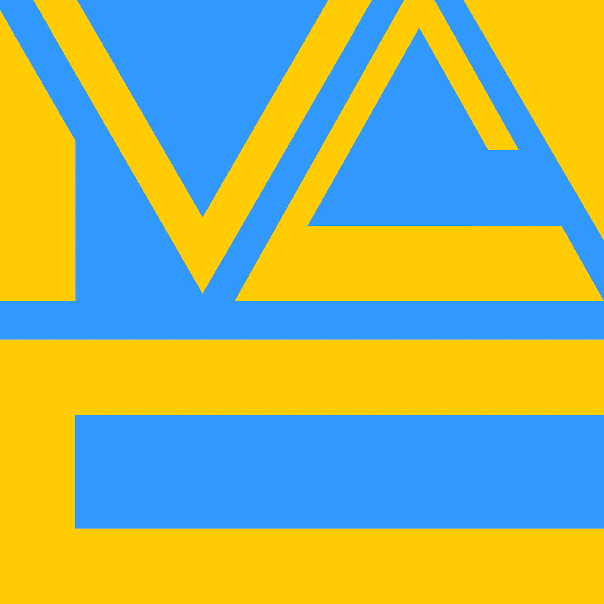
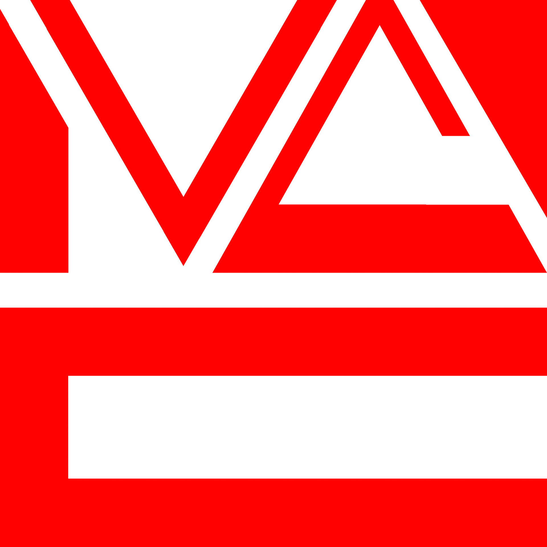
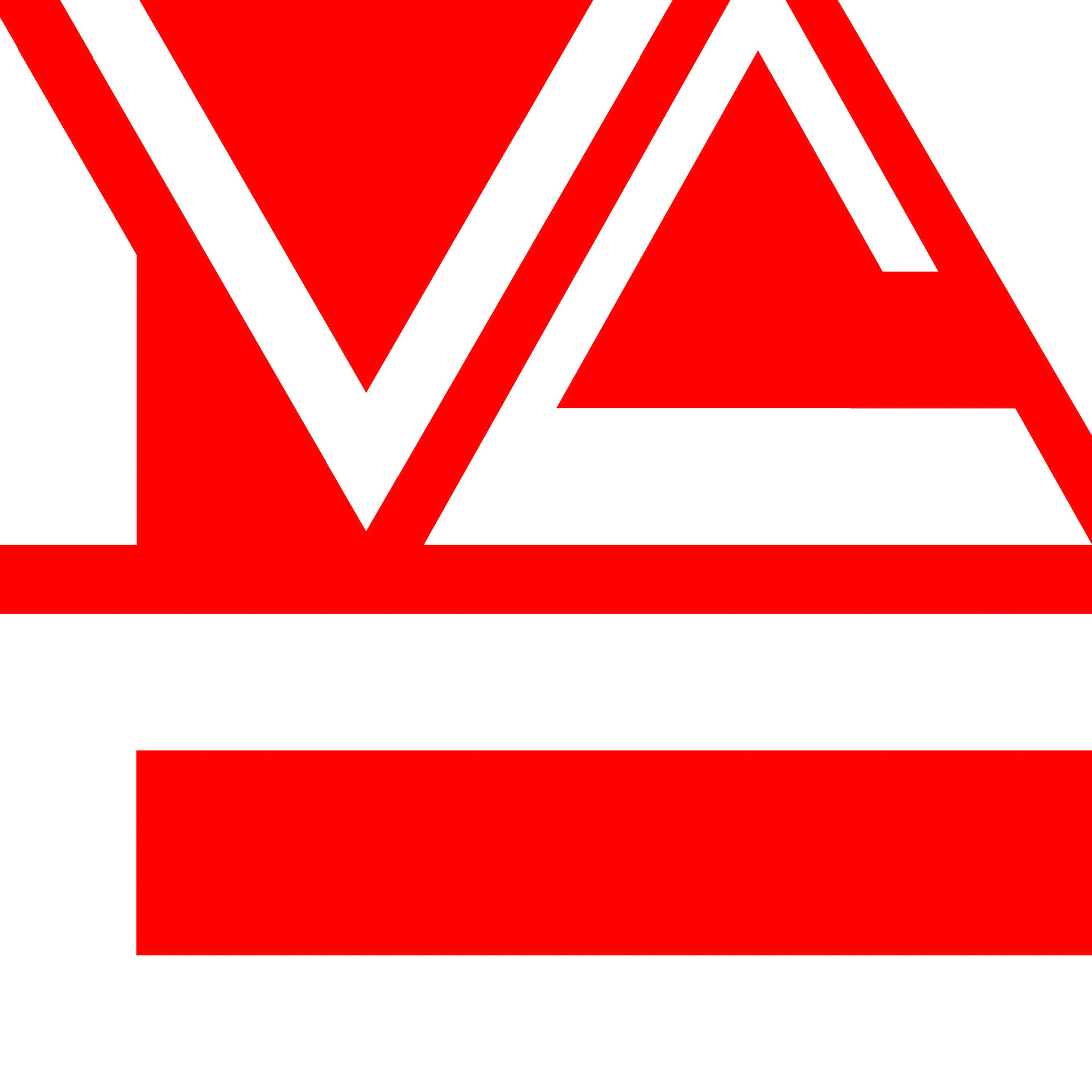
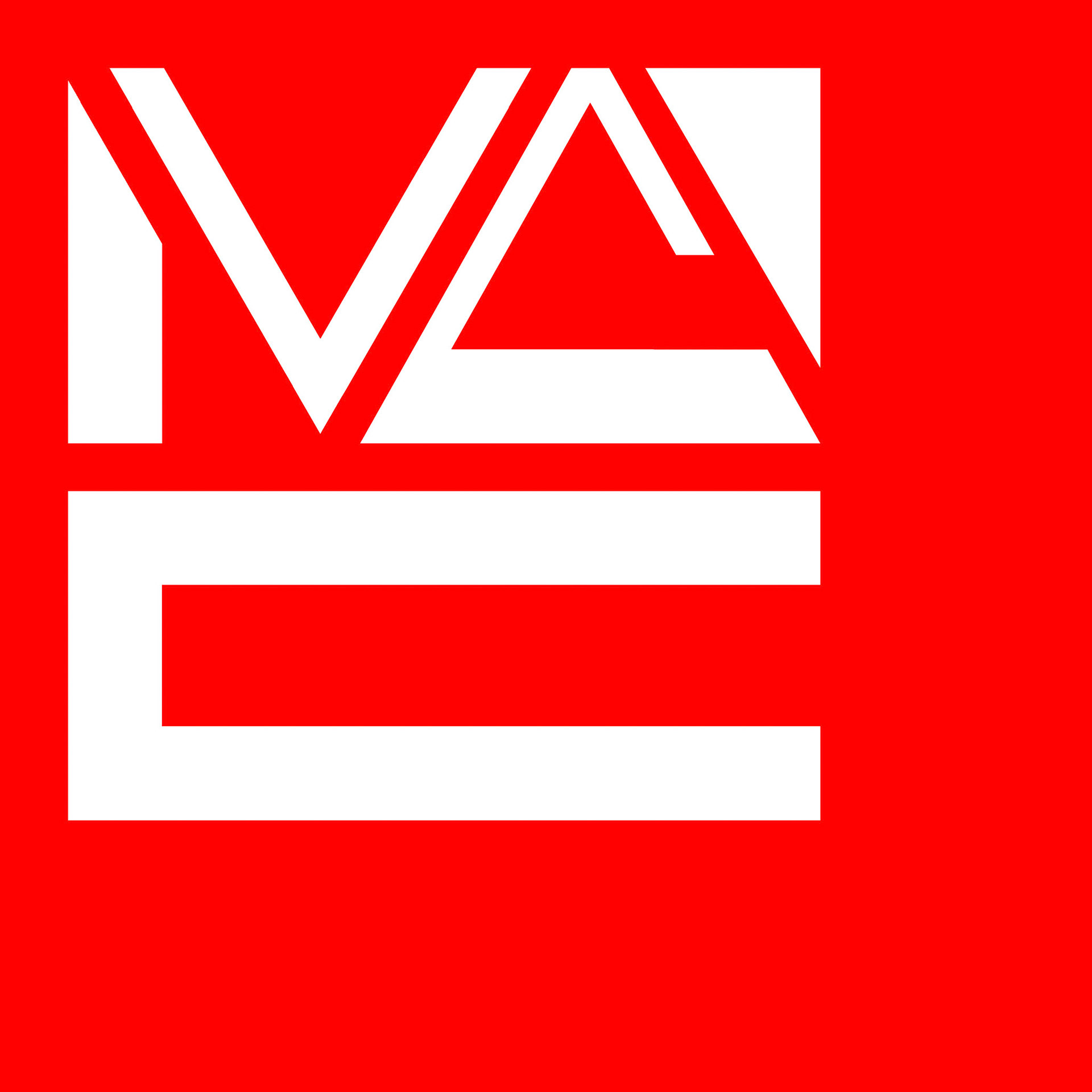
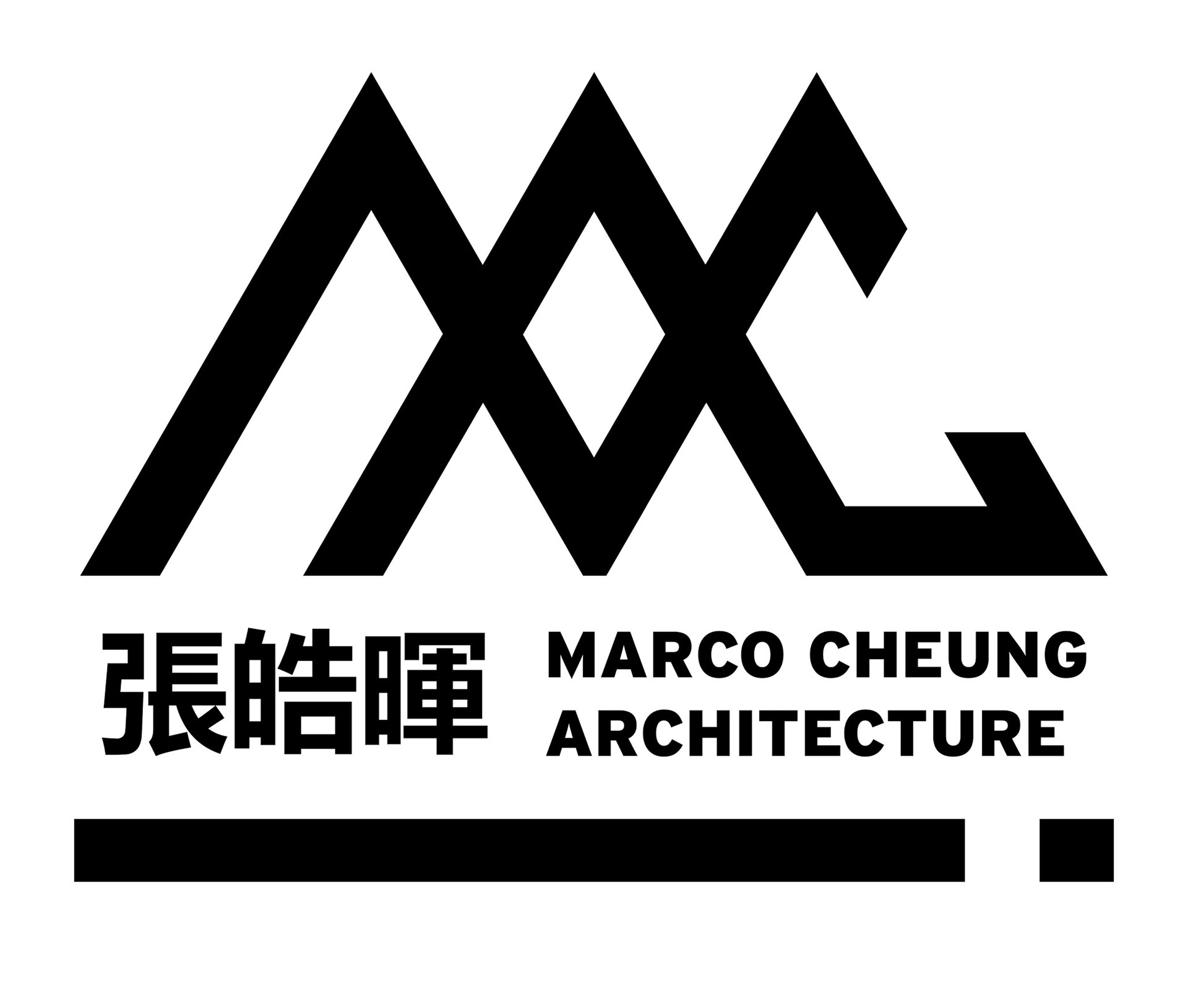
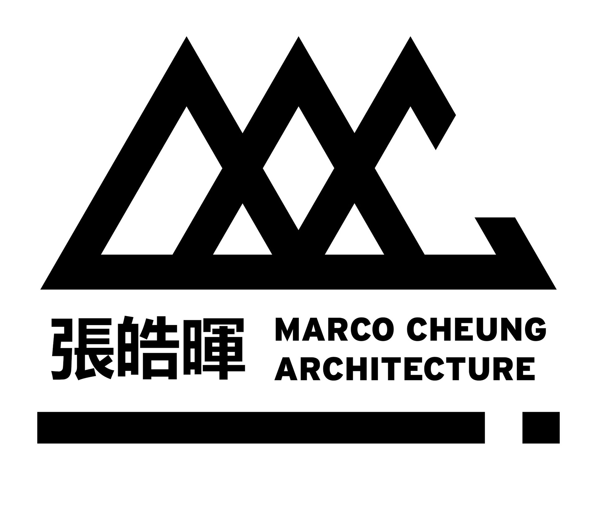
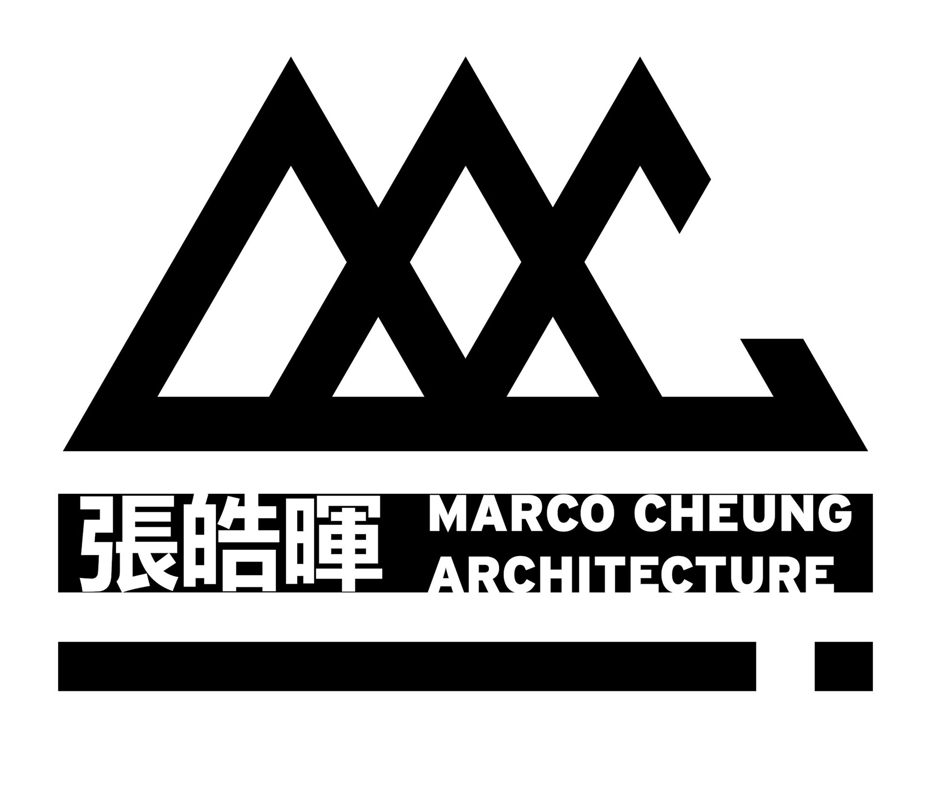
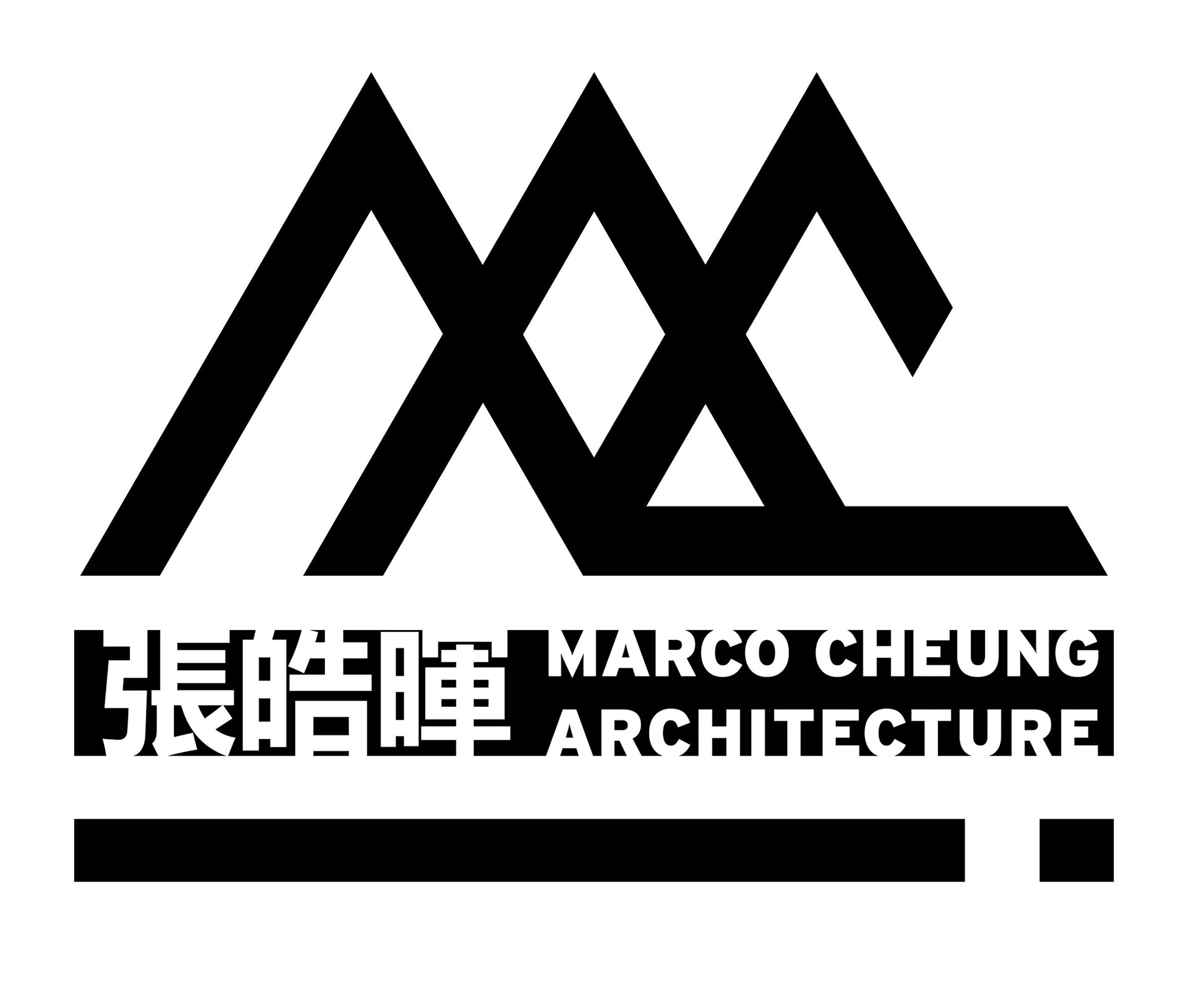
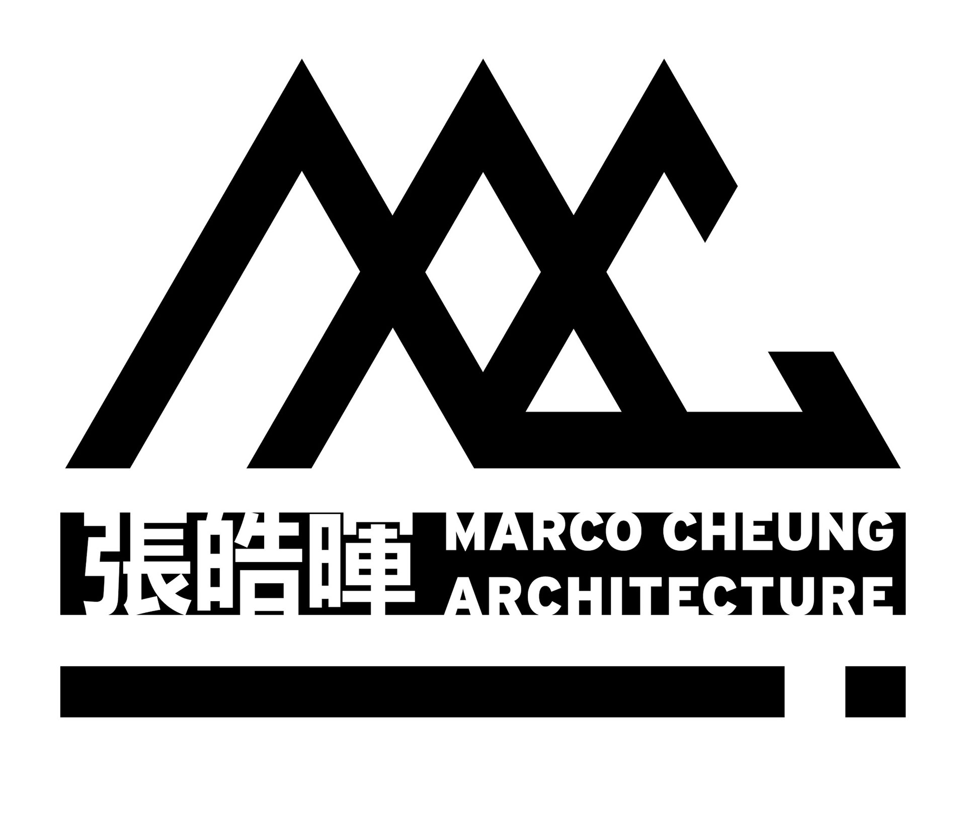
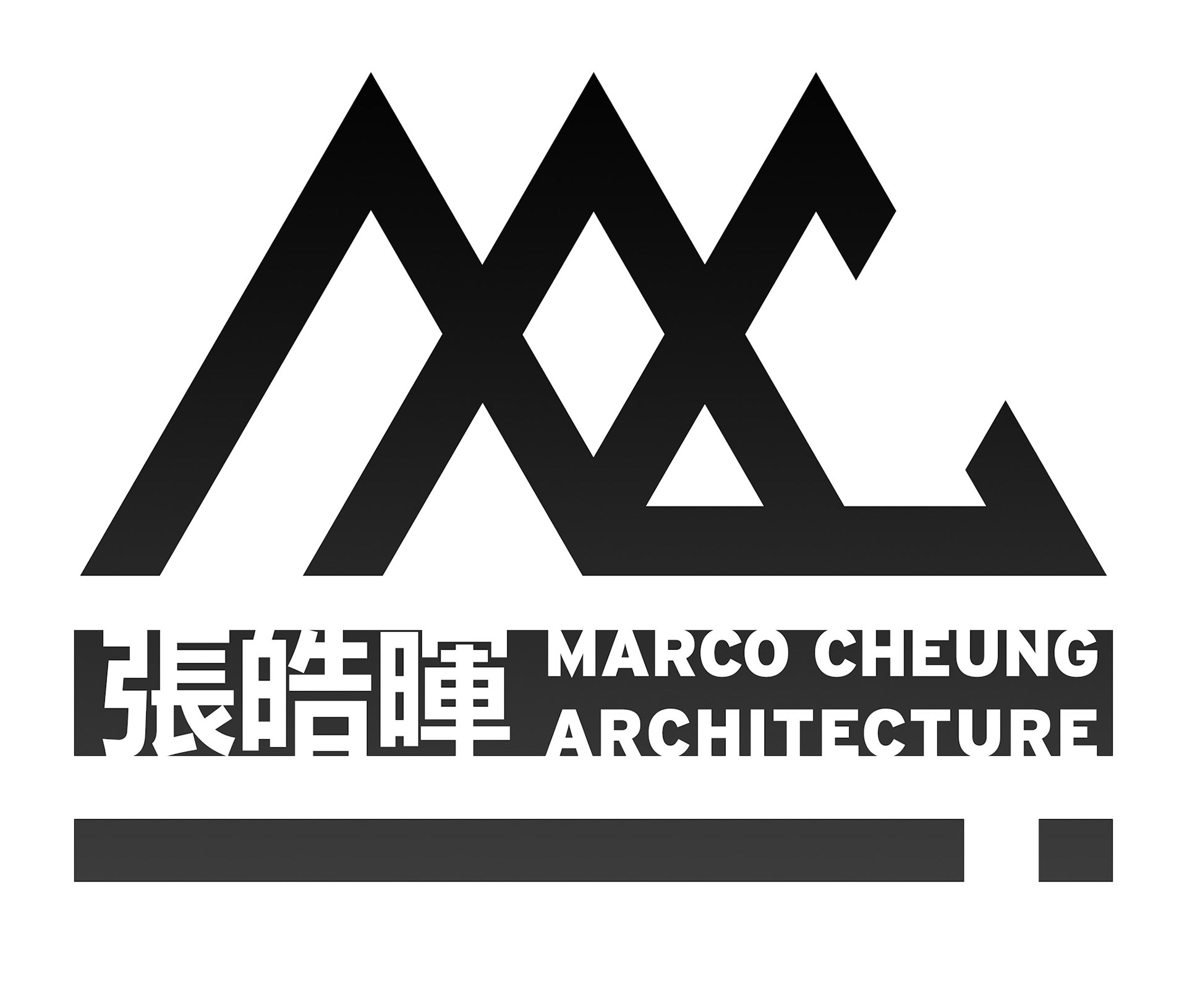
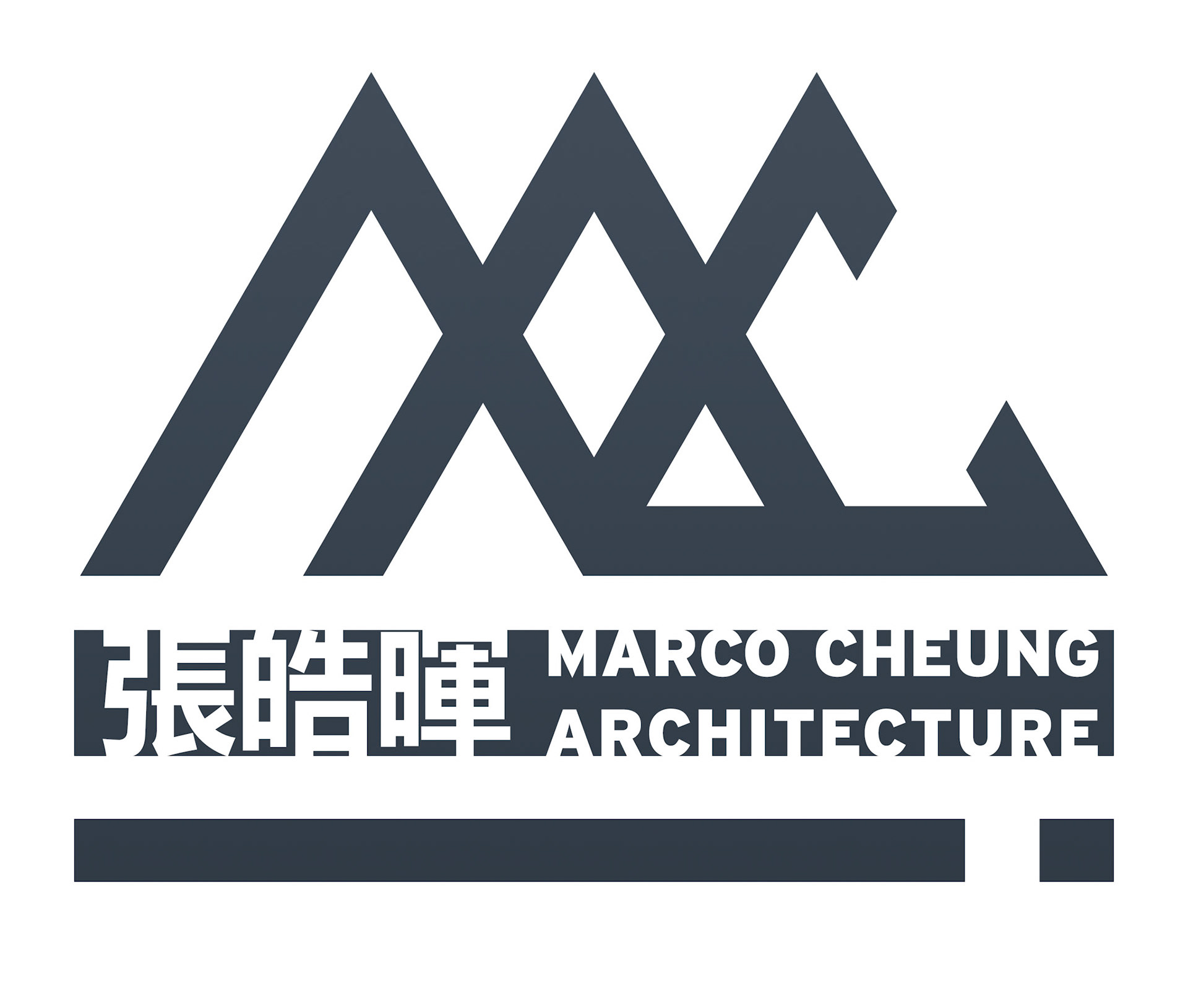
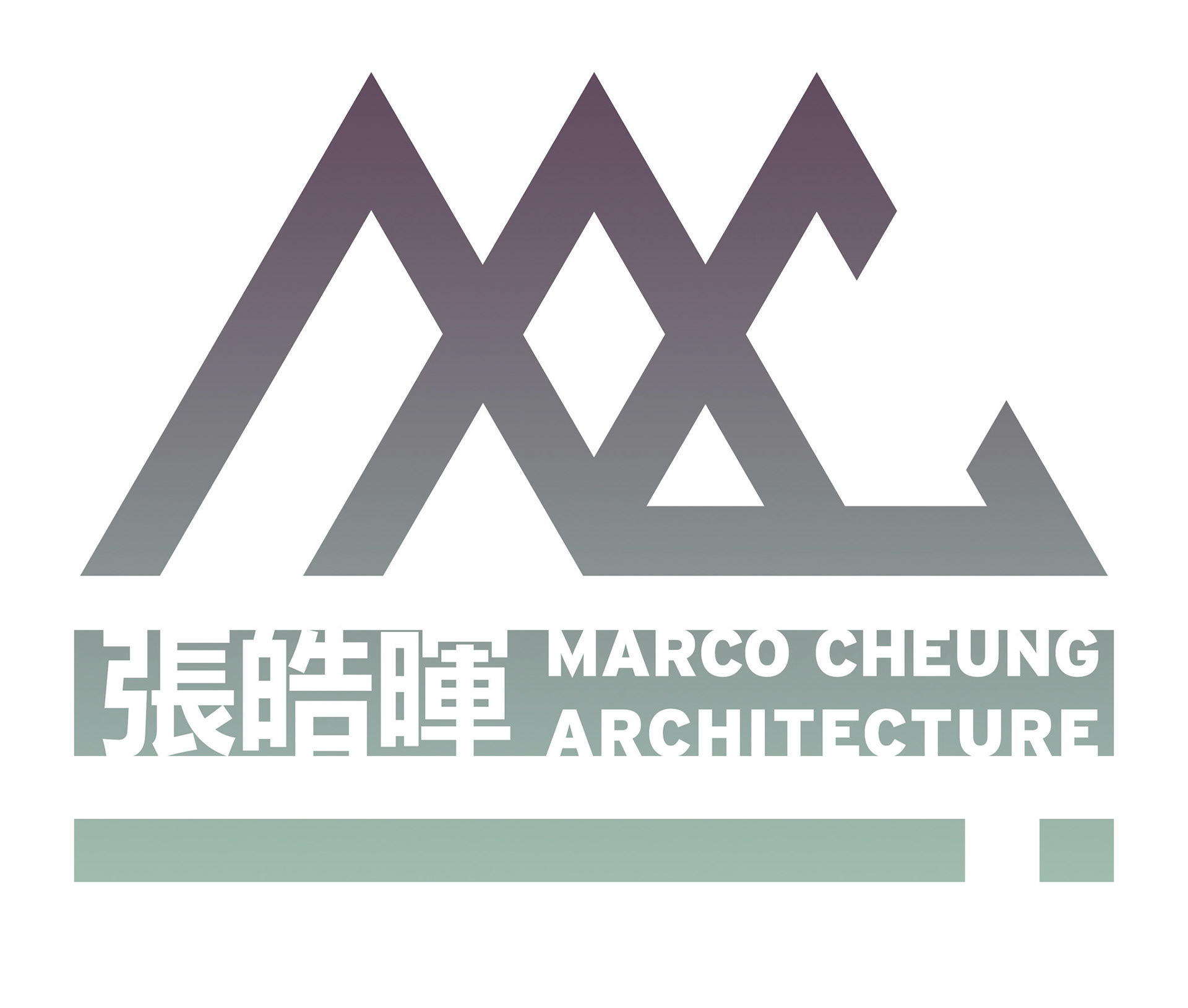
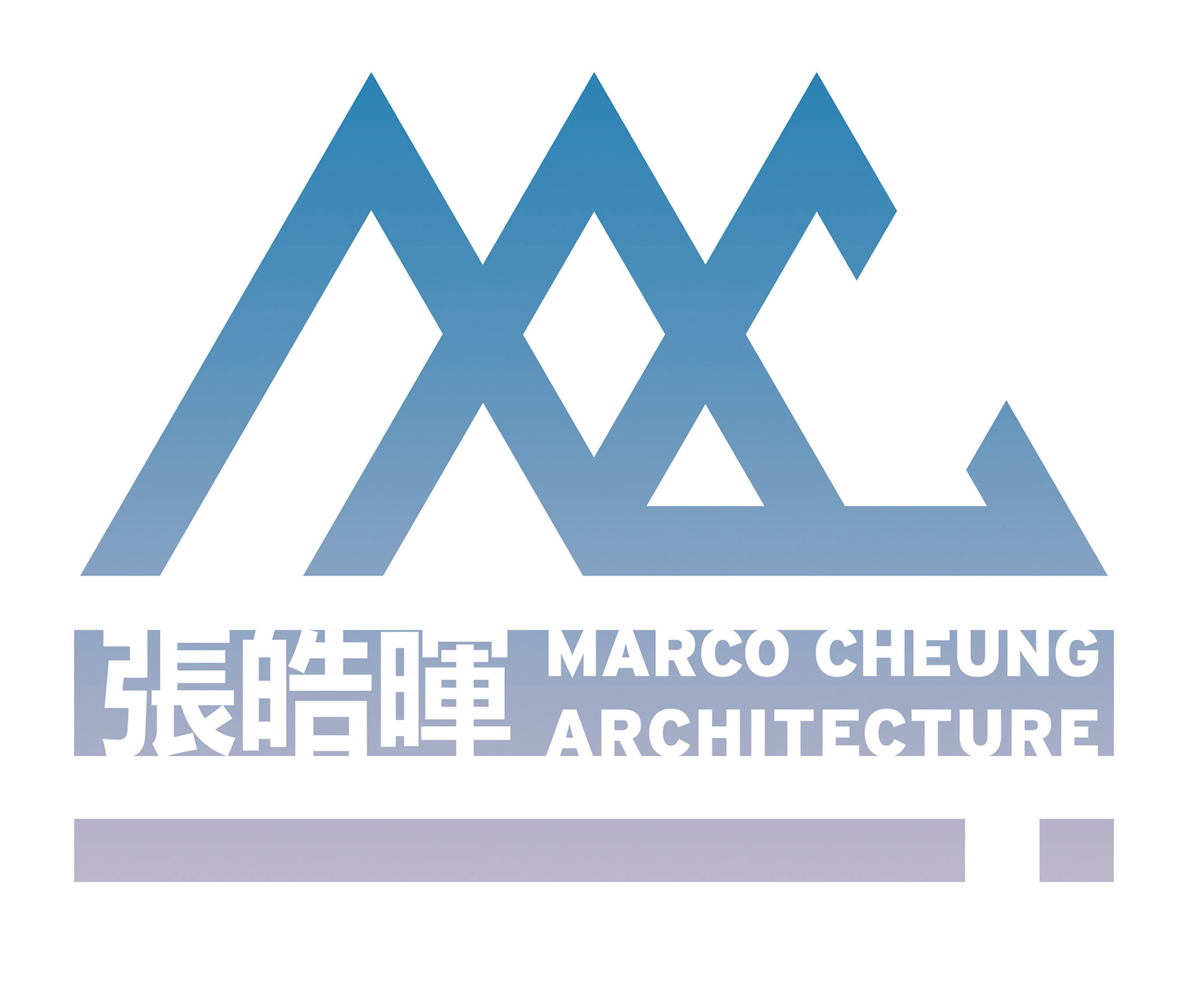
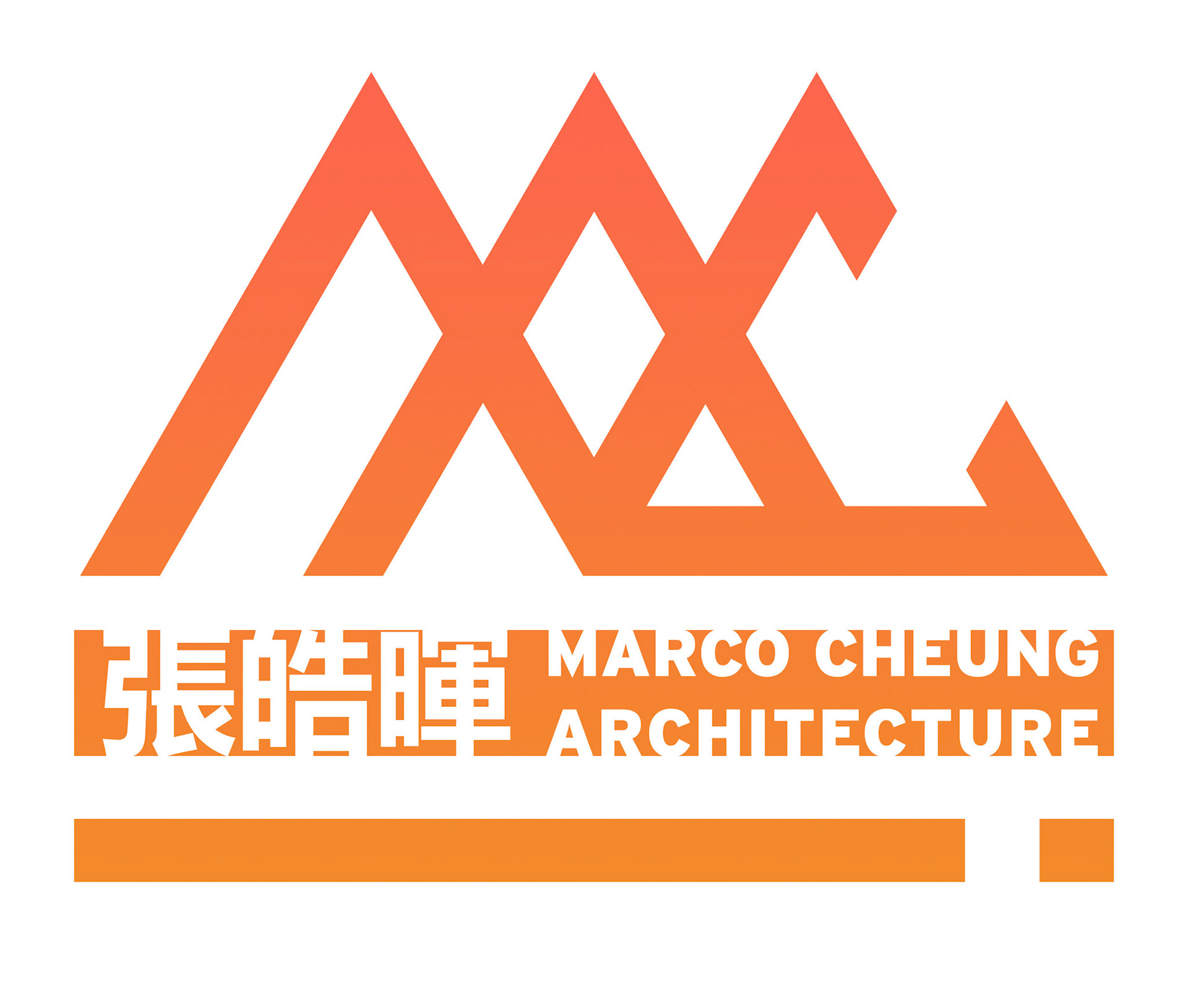
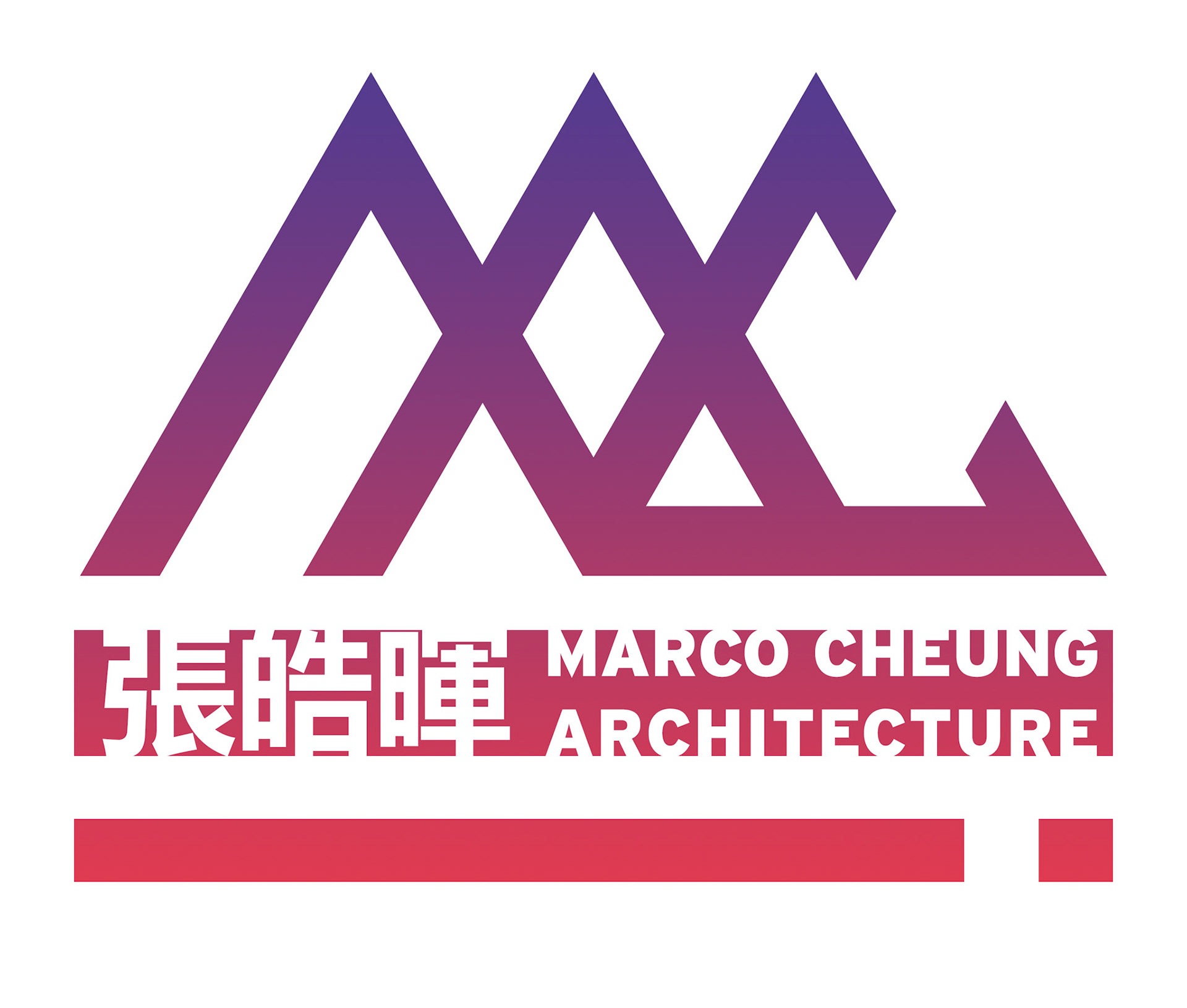
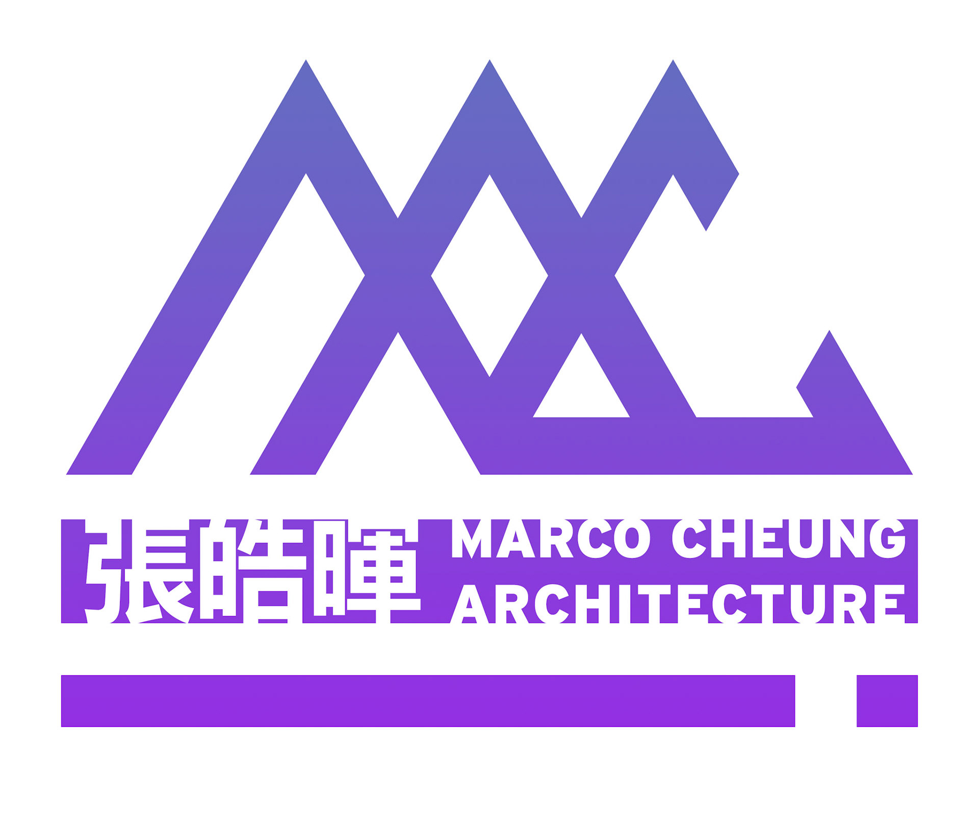
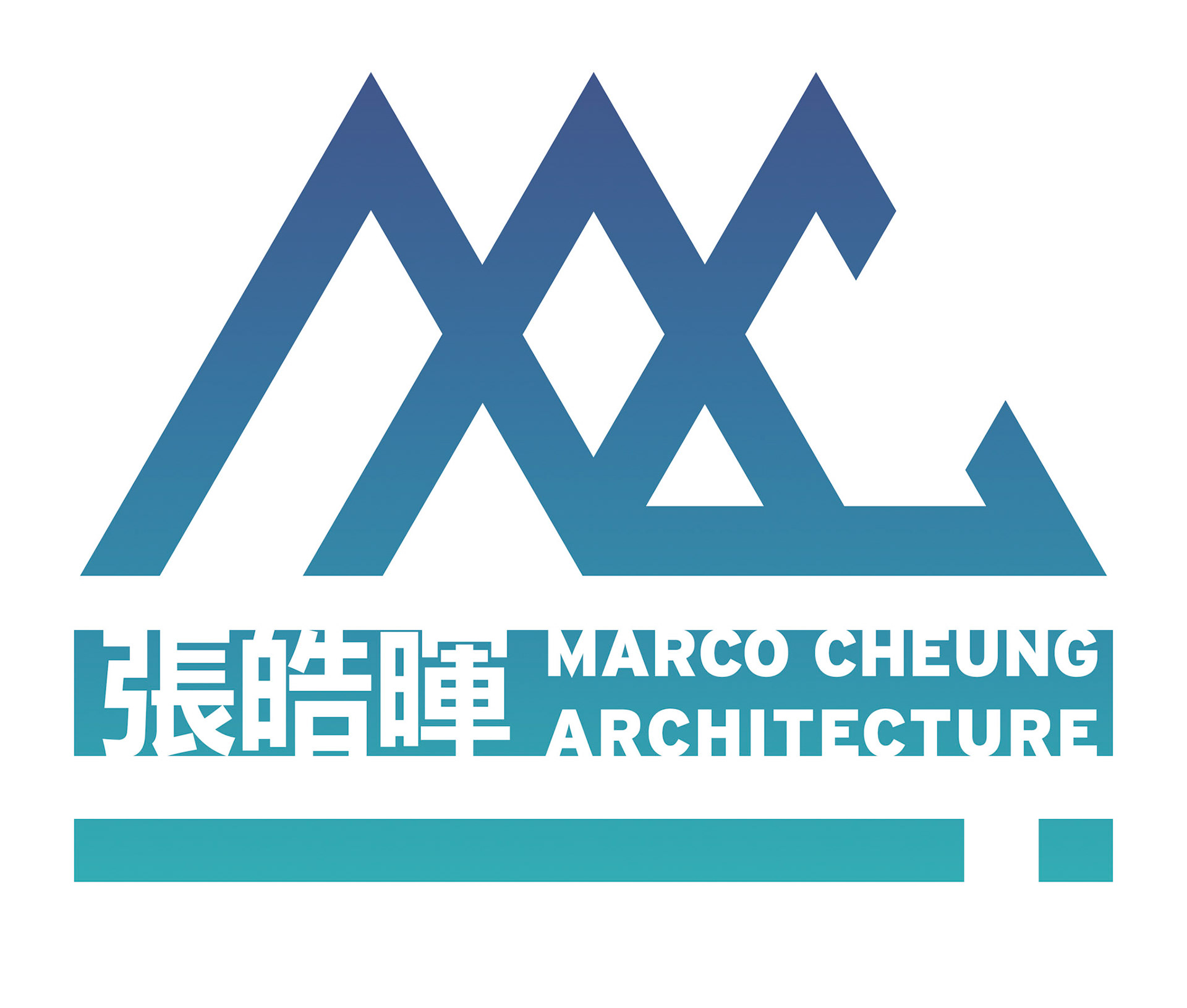
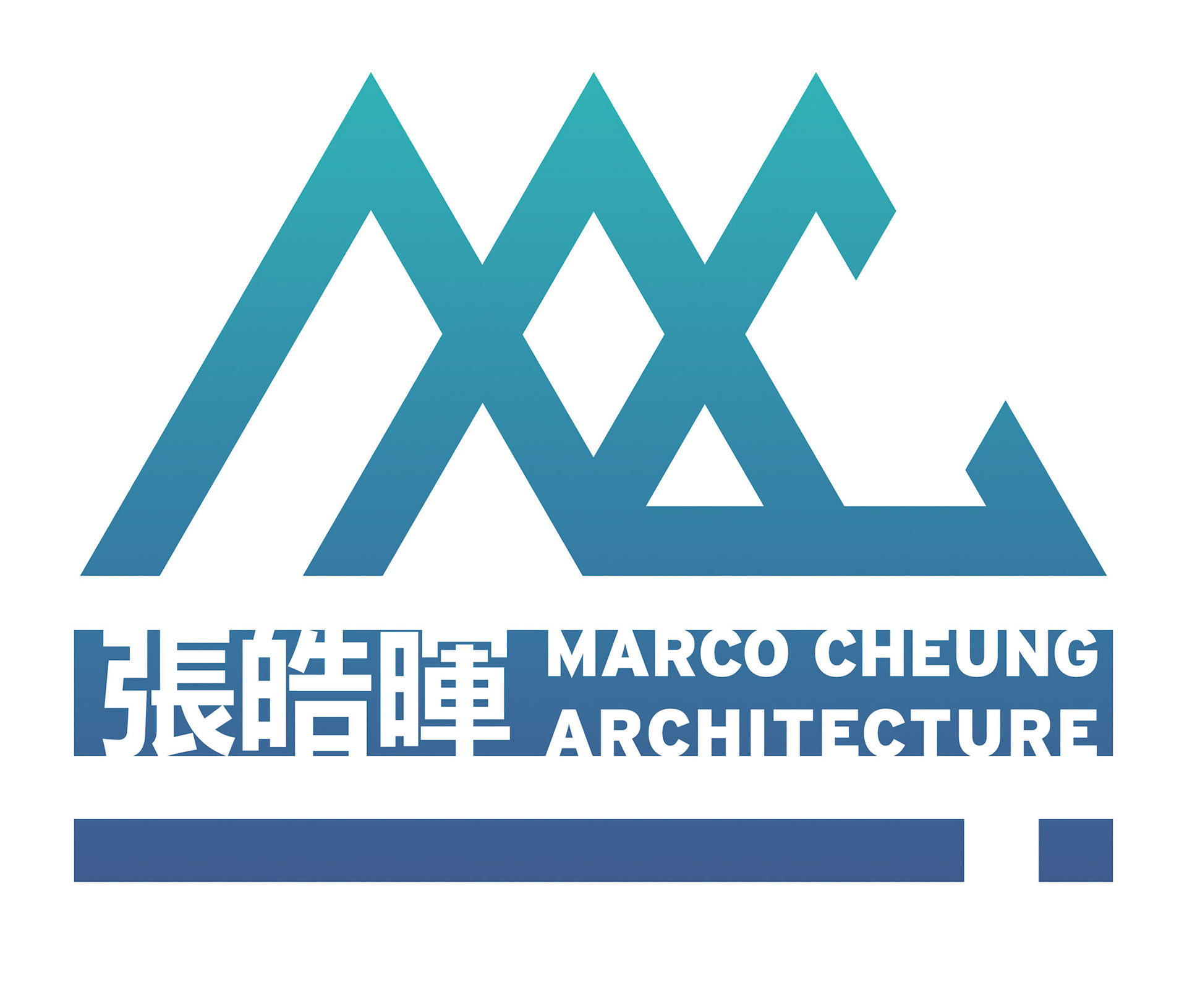
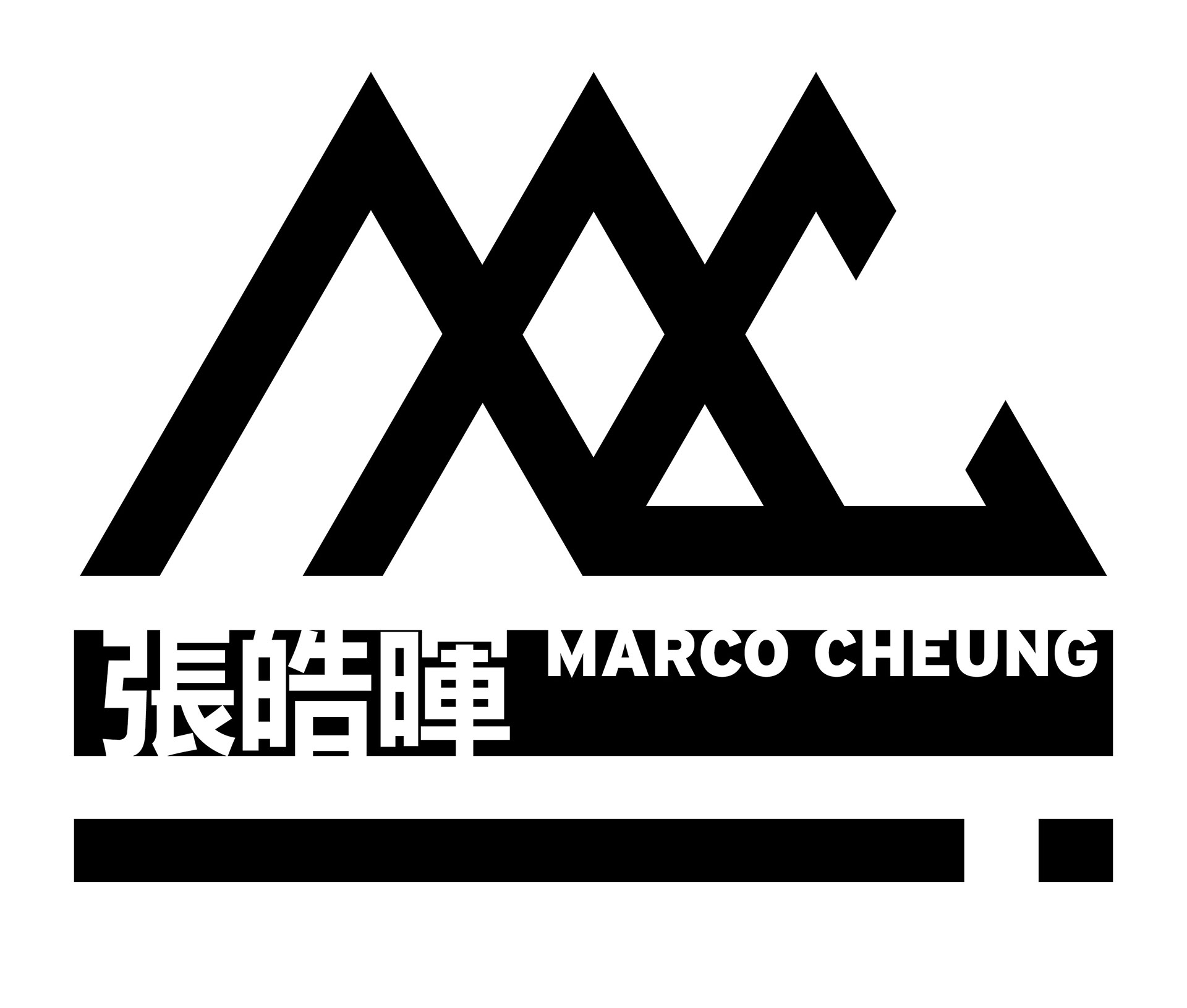
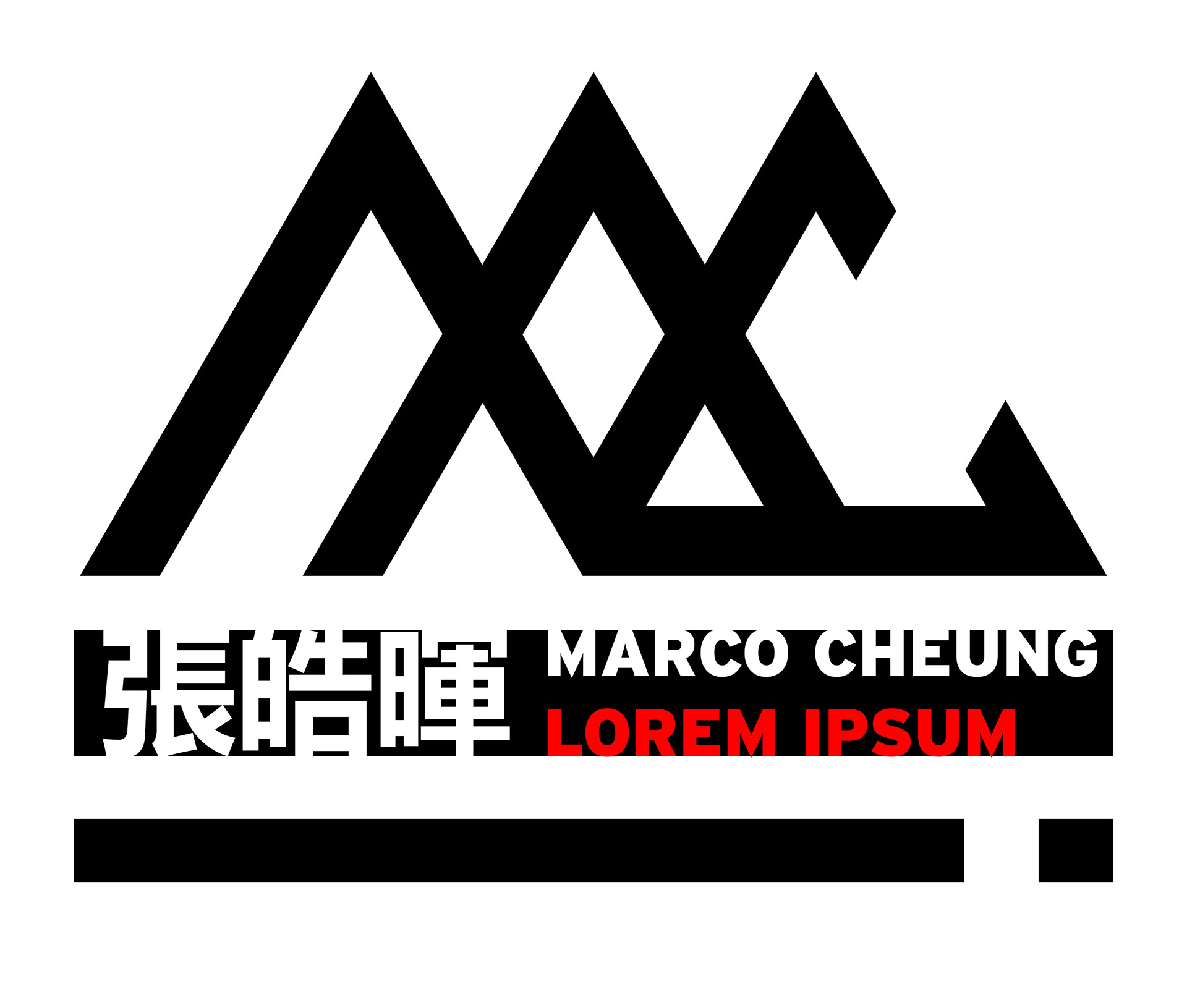
Final iteration of the logo.
A revising to a simpler and symbolic form inspired by the Latin 'M' and 'C' in a 3-delta arrangement reminiscent of the Chinese name.
Sparse openings result in a bold and open logo.
A revising to a simpler and symbolic form inspired by the Latin 'M' and 'C' in a 3-delta arrangement reminiscent of the Chinese name.
Sparse openings result in a bold and open logo.
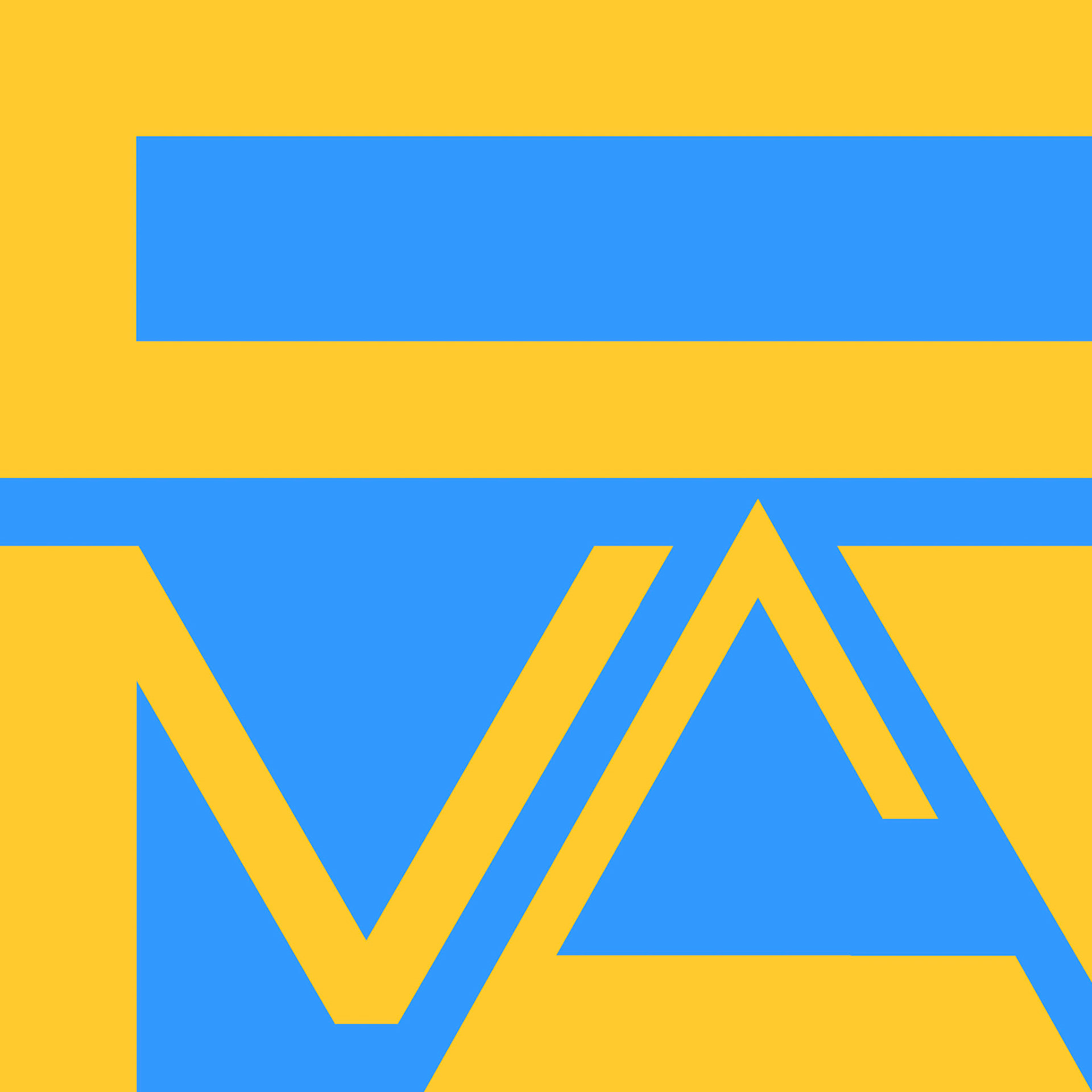
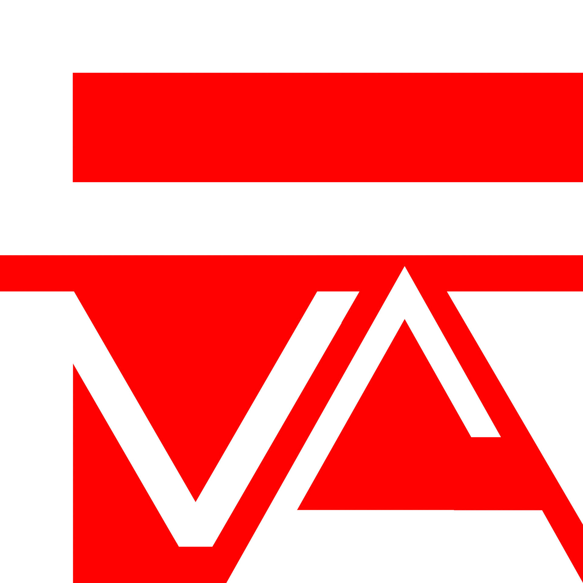
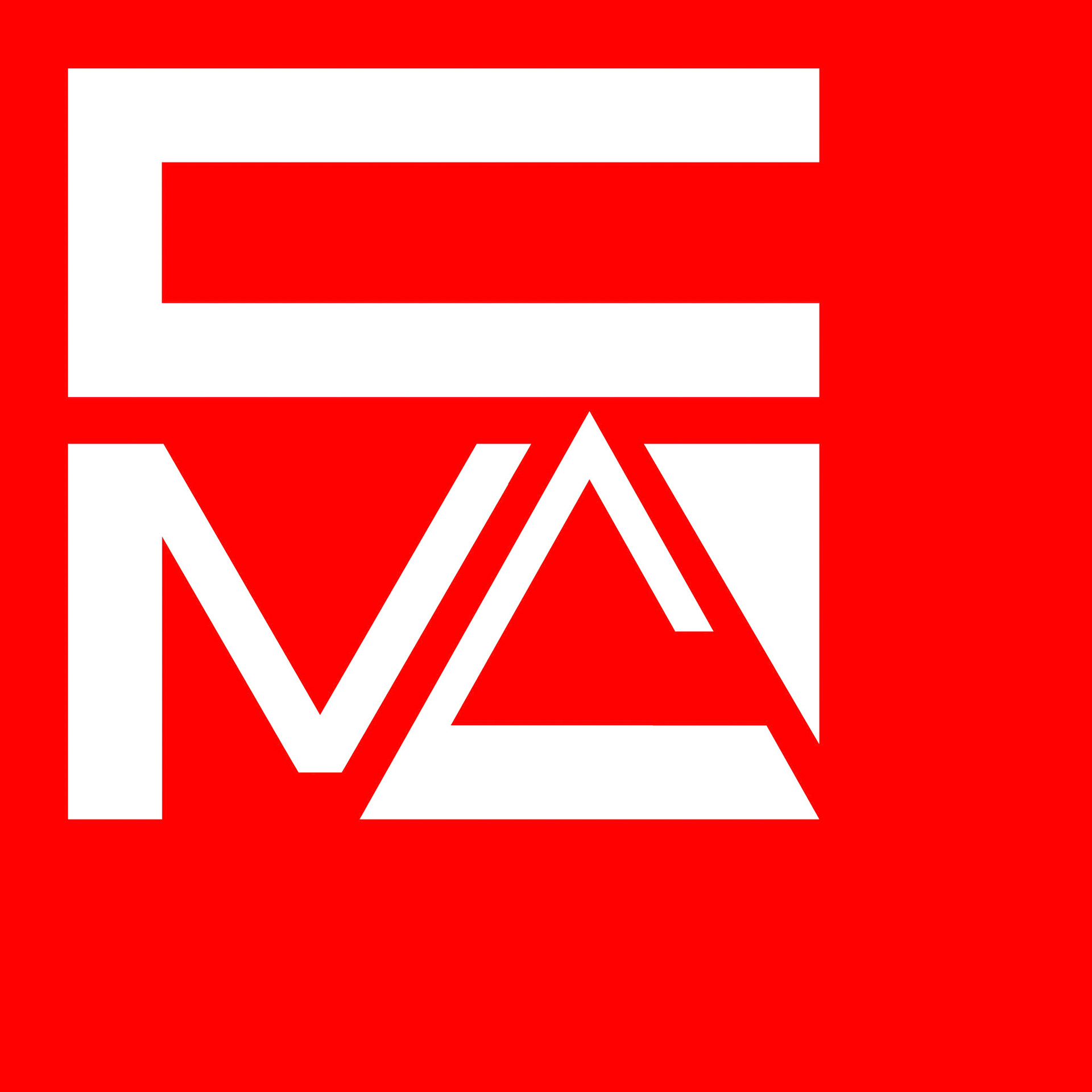
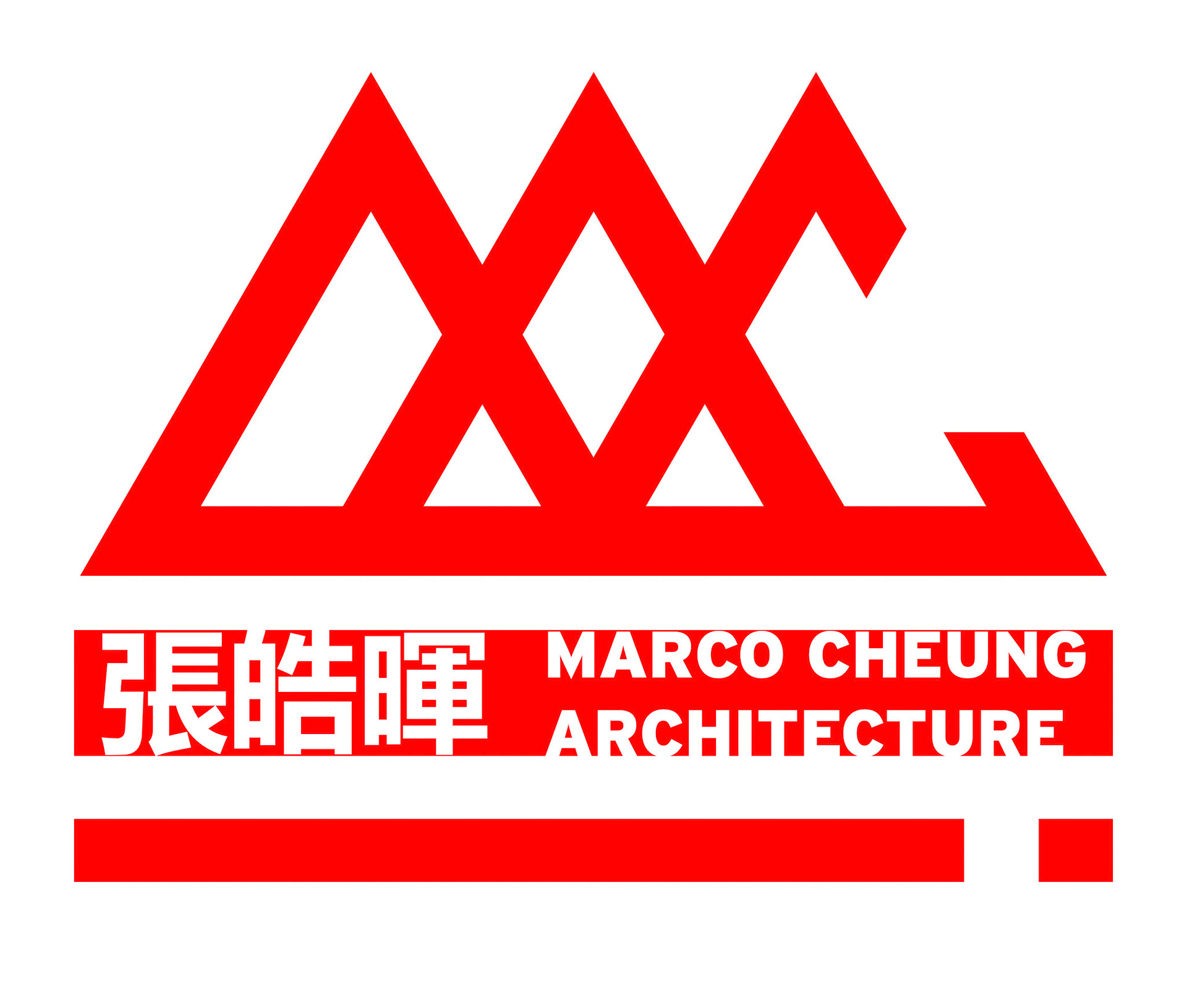
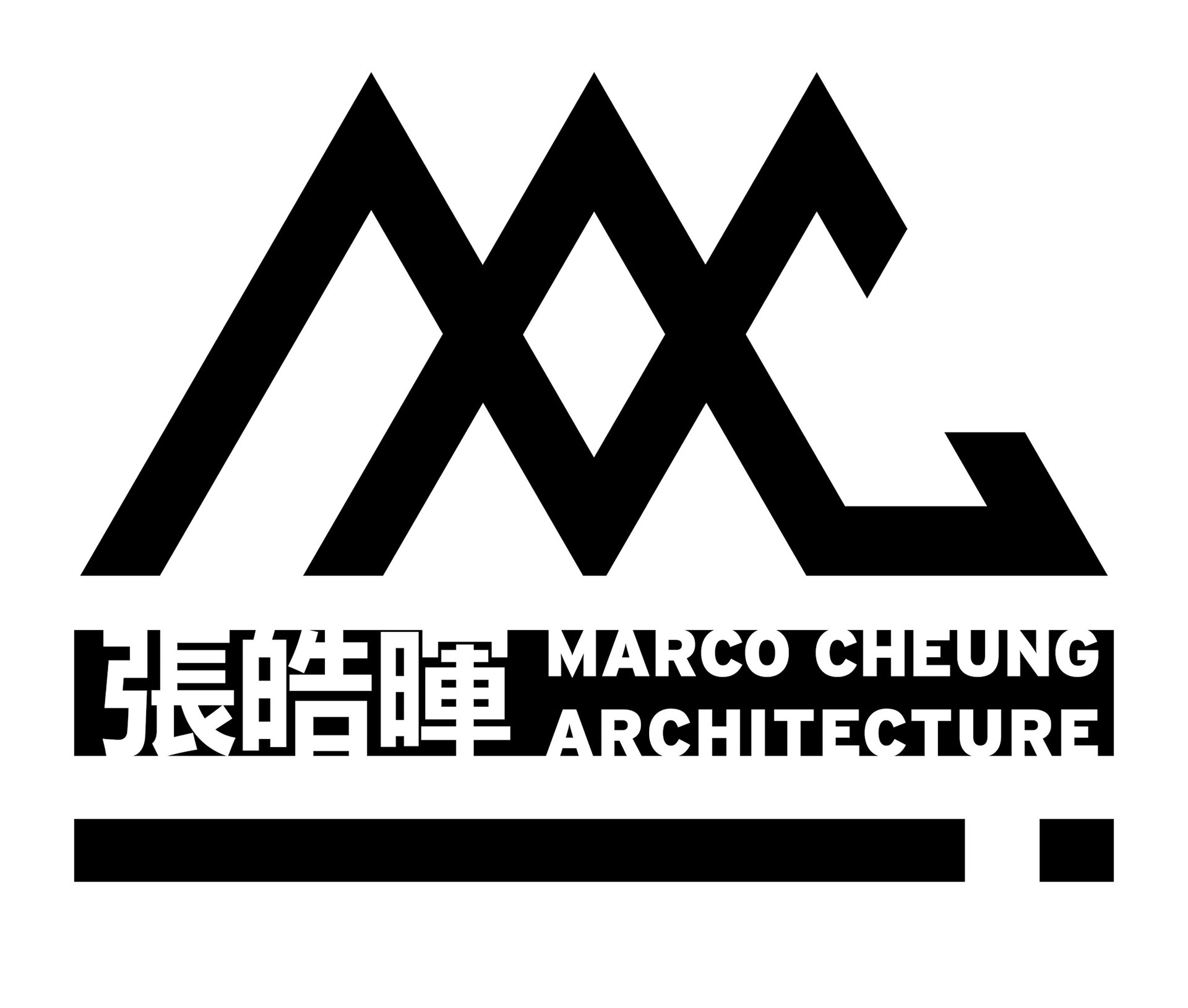
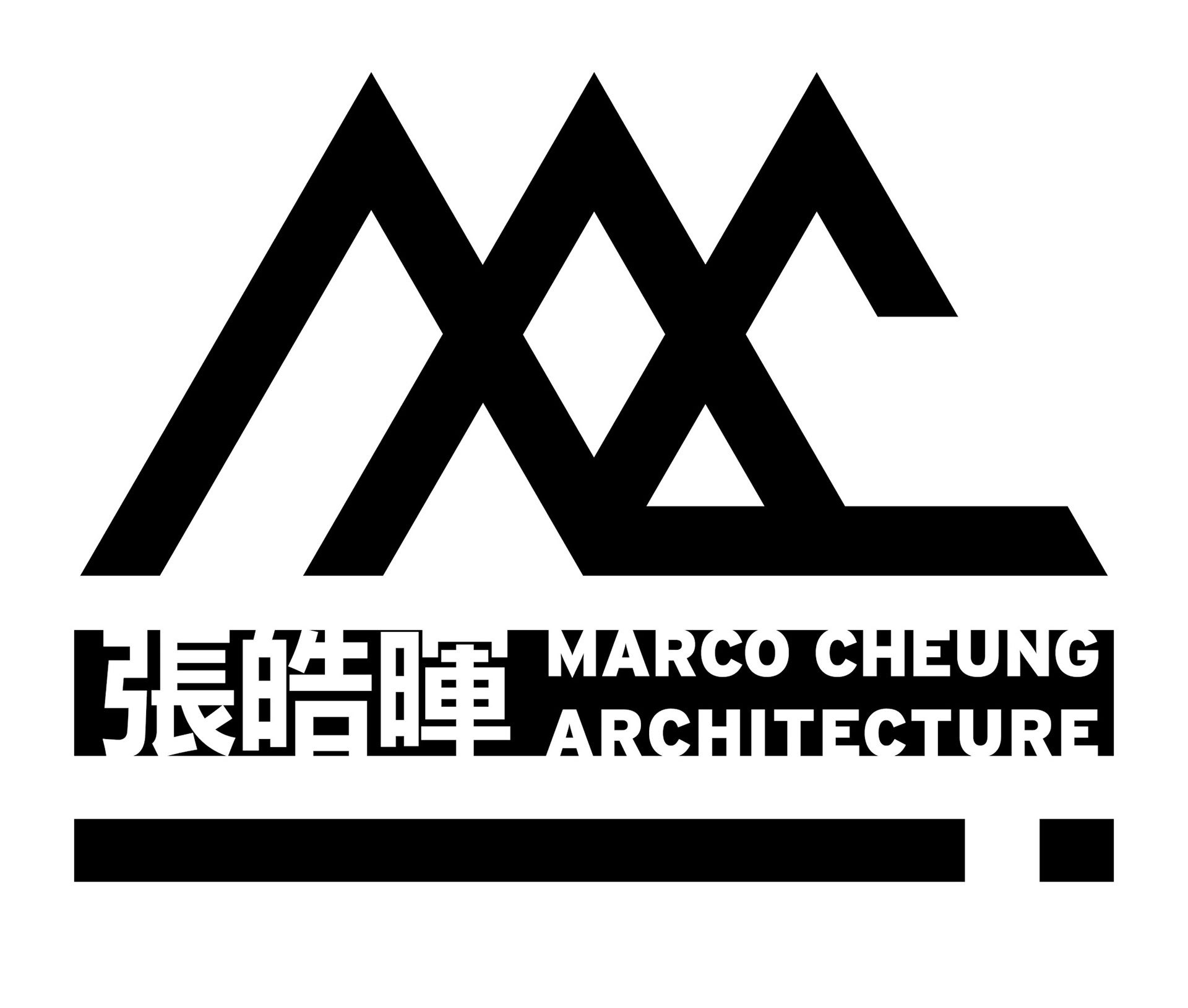
Alternate versions utilize the field to host text, providing contextual detail.
Colors utilized refer back to the Element Definitions assignment.
Colors utilized refer back to the Element Definitions assignment.